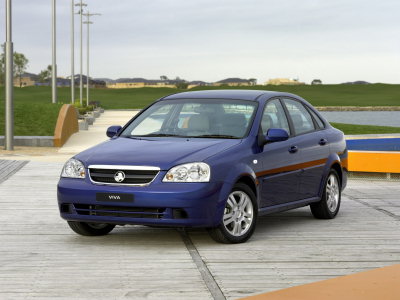
Tbh, I agree with Zero on certain things. The background change really lets it down, the windows look like they have just been cut out, rather than faded - the way their meant to look. The shadow on the ground should be darker, and your missing some shadow around by the front bumper. However, the front bumper suits it, but it doesn't suit the styling along with the flushed door handles. Reflections on the side are wrong too, the top half are perfect as you could class that reflecting the bushes, however the bottom half reflecting; it looks more like rippled sand, rather than a soily look that it should show. Front light looks un-finished, cause the left light should match, in which it doesn't in this case. Also, If I don't want to sound too picky, the tyres would look much better darker with some added contrast. You have done better, and better luck next time


