Global Rank: 0th (1234pts)
Reg: Aug, 2010
United Kingdom
Global Rank: 0th (18919pts)
Reg: Oct, 2009
Netherlands
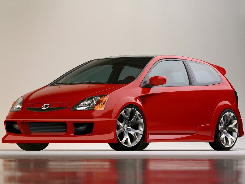
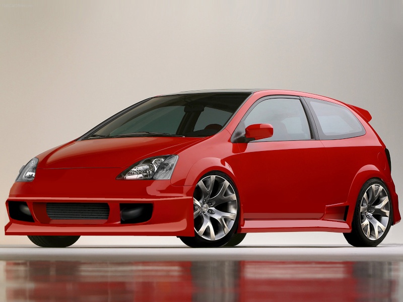
well i must say you need to look cloeser on the perspective and angle of the front bumper piece
its really off the left side is kinda low and looks bigger then the right side , that should be tther way around , not that extreme but what i mean everything further away apeirs to be smaller and in angles this is hard to get spot on
the orange with you used for the hightlight i find a bit too dark , should aslo be darker close to the bumper and lighter more towards the end of the bumper (sticking out and catching more light)
i would even think about two colors on the lip like orange like now but lighter and with a high feather (maybe feather 2-3) a white ref line along the side fading into the orange
the vent on the door ...really to black and the selections all are wonky
not meaning this harmfull but its a wip and you asked for help so i'm hounest , look at the left vent of the front bumper and the vent on the door , all bocy lones instead of nice flowing lines
if you cant work with the pen tool .. try using the eliptical tool and clean up lines with that
hope you can use this advise
my best advice would be .. try not to brush syuch a hard project already , the colors on this have a lot of variations and the lighting isnt easy to replicate , i would take a simpler pic and do more re-brush and small add brush .....

Global Rank: 0th (1234pts)
Reg: Aug, 2010
United Kingdom
Global Rank: 0th (9147pts)
Reg: Nov, 2009
Brazil
you could show Donnor wheels?
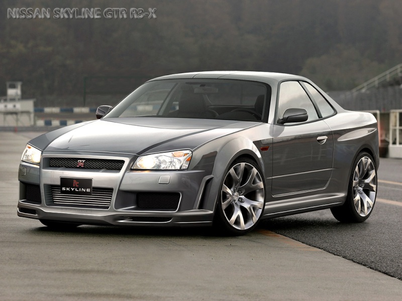
are equal to the Skyline http://www.autemo.com/dc/users/1/XOT1Z/331/chops/ID_Nissan_Skyline_GTR_R3X_Concept_by_iacoski.jpg the iacoski's
are equal to the Skyline http://www.autemo.com/dc/users/1/XOT1Z/331/chops/ID_Nissan_Skyline_GTR_R3X_Concept_by_iacoski.jpg the iacoski's

Global Rank: 0th (8761pts)
Reg: Aug, 2009
Belgium
RDJDesign wrote:
you could show Donnor wheels?
are equal to the Skyline http://www.autemo.com/dc/users/1/XOT1Z/331/chops/ID_Nissan_Skyline_GTR_R3X_Concept_by_iacoski.jpg the iacoski's
are equal to the Skyline http://www.autemo.com/dc/users/1/XOT1Z/331/chops/ID_Nissan_Skyline_GTR_R3X_Concept_by_iacoski.jpg the iacoski's
And turn them more counter clockwise.
Global Rank: 0th (1234pts)
Reg: Aug, 2010
United Kingdom
Global Rank: 0th (1234pts)
Reg: Aug, 2010
United Kingdom
Global Rank: 0th (9582pts)
Reg: Oct, 2009
Poland
Global Rank: 0th (1234pts)
Reg: Aug, 2010
United Kingdom
Global Rank: 0th (8985pts)
Reg: Nov, 2009
Argentina
And that means that you stole his work


