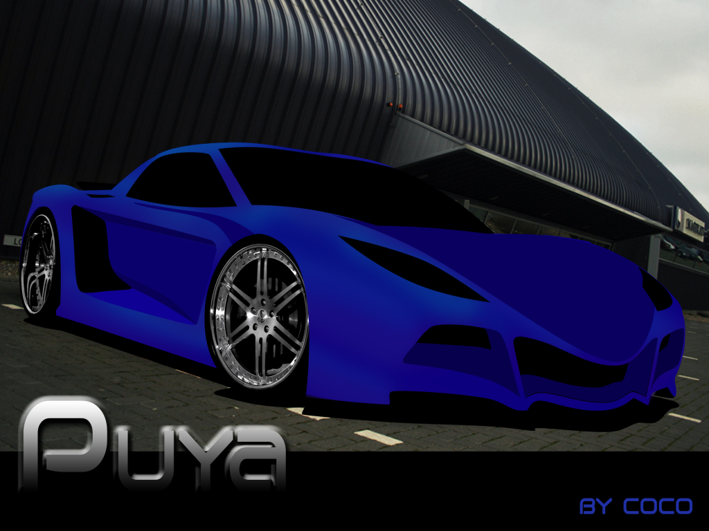
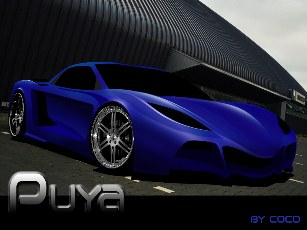
\"Puya\" by Coco

Heres my new chop. The wheels are not the ones i plan to use i just put them there for reference.
Base Image:
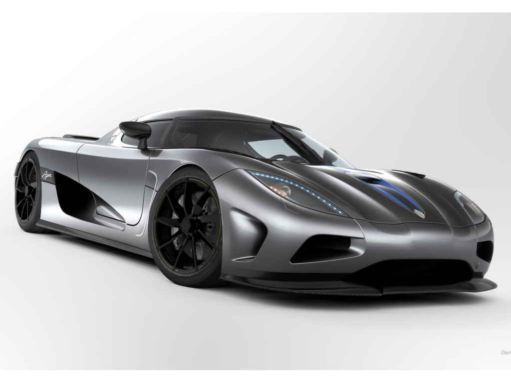
PUYABase.png
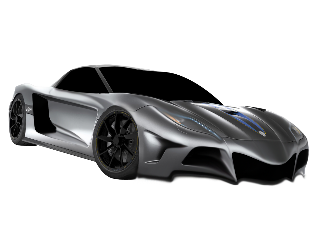
Morphed Base Image:
PUYABaseReady.png
Shapes:
PUYA.png
First Update:
PUYAUpdate1.png
All Comments, suggestions and constructive criticism is welcome. I want to make this chop special and i know you guys out there can help. Thanks in advance! :-d
Post edited March 15, 2010 at 08:17:51 PM by Coco
Sig.png
Great design!
92% of the teenage population has moved on to rap. if you are part of the 8% that stayed with rock, put this in your profile
This is going to look wicked! Is it based on an Rx7? I'd like to see you add a curve or a bit more shape to that sideskirt, that way it will match and flow with the front bar a bit more :-d Keep it up mate
Thanks Guys, first update is up with the base image and how it turned into what the chop is now. Please read the first post, thanks! :-d
Sig.png
New Update, i started to work on it and here is the 2nd update. I uploaded it in hr so that it would be easier for you guys to comment and for me to correct any issues that might need fixing.
puyaupdate2r.png
By el_llaco at 2010-03-17
.
puyaupdate2r.th.png
Sig.png
Looking sick man :-d
i don't like the rims that much :/ but thats just me, I like black rims xD
RJ Andersen wrote:
Looking sick man :-d
i don't like the rims that much :/ but thats just me, I like black rims xD

x2 chrome doesn't do it for me

Brushing is looking good so far!
92% of the teenage population has moved on to rap. if you are part of the 8% that stayed with rock, put this in your profile
"The wheels are not the ones i plan to use i just put them there for reference." :)

ont: brusing looks good so far, think that this could come out great!
good luck :)
fishen wrote:
"The wheels are not the ones i plan to use i just put them there for reference." :)

ont: brusing looks good so far, think that this could come out great!
good luck :)

hehe thanks Fishen, guess that my friends just dont read...hehe :P just playing witcha guys! xD
Sig.png
i'm sorry, i don't like the rims :/ haha, only kidding :P looking nice, great color. cool design, going to be epic :-d
car town @ facebook
Back to top

Please login to post