Global Rank: 0th (7761pts)
Reg: Feb, 2011
United Kingdom
Global Rank: 0th (1135pts)
Reg: Oct, 2020
Italy
Global Rank: 0th (5161pts)
Reg: Mar, 2019
Australia
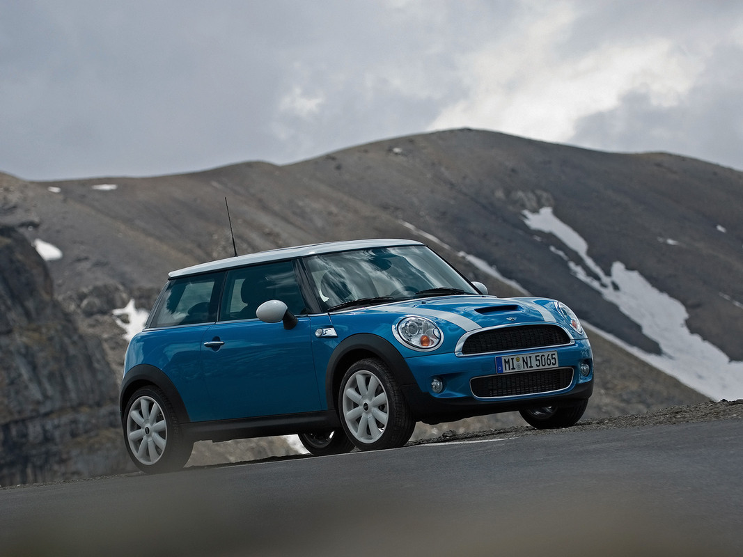
You didn't remove the out of focus plants, I can see a sharp edge on the body where you lowered the car. A simple contrast adjustment or overlay brushing could've fixed that. Also I will note that the tyres are not blended in nicely, they seem to pop out of the scene.
Otherwise, the rest is pretty clean.
Otherwise, the rest is pretty clean.
Global Rank: 0th (12291pts)
Reg: Aug, 2009
Finland
hexaflux wrote:
You didn't remove the out of focus plants, I can see a sharp edge on the body where you lowered the car. A simple contrast adjustment or overlay brushing could've fixed that. Also I will note that the tyres are not blended in nicely, they seem to pop out of the scene.
Otherwise, the rest is pretty clean.
Otherwise, the rest is pretty clean.
This sums it up for me aswell.
Global Rank: 0th (7761pts)
Reg: Feb, 2011
United Kingdom


