Thanks for the feedback for everyone !

ddd racing wrote:
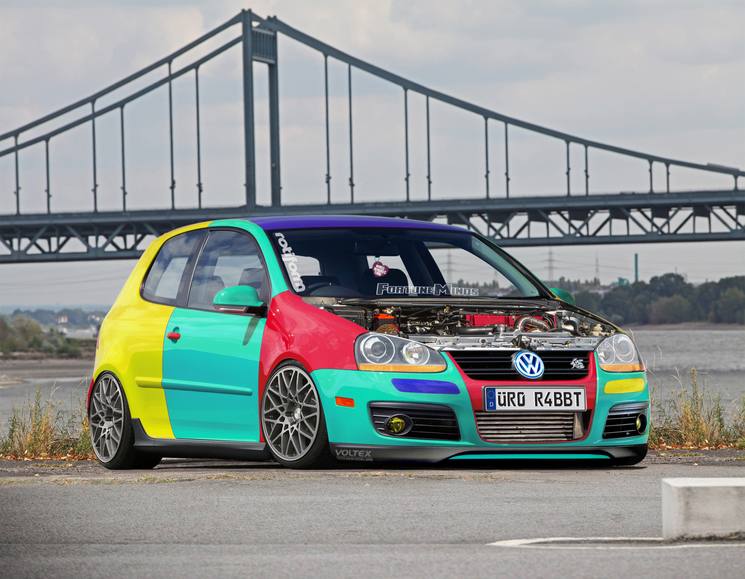
It's a nice chop overall, I like the multi color, it reminds me of the harlequin. You should improve the reflections of the new, in the sense that they should be accentuated as in the front fender, the inside of the miniskirt is to be improved as its integration with the body, on the roof you notice a little red, beautiful lfrontal and the inside the engine compartment.

I know that roof has a little part of red near the front glass, but my screen has a lot of contrast and I even't noticed because my screen has a lot of contrast

matt_193 wrote:
Nissan Boy, (excuse my language) but what in the living f*** is wrong with you?
90% of the chops you comment on u say "cool chop bro" and u give it 10/10 points even though the chop is filled with mistakes and issues here, where the chops is solid with few mistakes you give it 2/10 because you found a slight mistake in the intercooler and a small green lip that you think shouldnt be there!
man c'mon!
About the chop, i think you did well with the multi color! Looks quite realistic, the intercooler is slightly off and it lacks shadows! The engine bay looks a little flat to me but other than that i think DDD Racing has said the rest! Well done, 7/10 from me too!
I made this chop to try to get the maximum realism as possible, that was the main purpose! The intercooler was a last minute change because I wanted to add more agressive front

xDEMON93x wrote:
Good job - requiring light fixes and it would be great!
Nissan Boy - I think he was just wrong, because the work does not deserve a rating of 2.
Style is a relative concept. If we do not like it, let's just judge the performance!
Easy without aggression!

Nihad08 wrote:
When I saw the chop I immediately thought "this is soo 2010"
About the chop itself... interesting.
Few flaws tho such as some jaggy selections where you can see the car was red originally, fortune minds sticker is little off and wheel whores thingy could be implemented better. I can see the old bg or something under the car and wheels should be bigger in my opinion, those look like 16-17 inch.
Keep up the work!

It's normally that looks soo 2010ish, it was started at 2012 and I finded as a wip cleaning my pc files

. The part as you see under the car is the new background, but without grass, because I added it only at the left of the car as you can see at the next donors image. Yup, I think the wheels looks 16 or 17" but I don't like big wheels for low cars, the detroit oem gti wheels was 18" and 17's, that's the reason that I prefered 16-17 inches, because looks great on statics mk5's.


