TOYOTA AVANZA VELOZ

Actually this is my old chop that i've never post.
hope you guy's like it.

38427023366_8e24323cf5_b.jpg

26707096599_4c14de1ab0_b.jpg

:D
guzseedants.gif
cotmmarch2013.png
0.00 (0 votes)
Shame that there is such a large difference between the bits you copied and the bits you brushed...there is essentially 50 shades of blue on the car...almost all panels are different colors!
matt_193 wrote:
Shame that there is such a large difference between the bits you copied and the bits you brushed...there is essentially 50 shades of blue on the car...almost all panels are different colors!

You have to remeber, i'm just Novice and still learning about chopping!
if you can't show your respect so tell me what can i do to make it better..!?
guzseedants.gif
cotmmarch2013.png
One area that is mainly distracting is the front door (as its right hand drive i'd refer to it as a drivers door)...the blue is much darker and blurry in comparison to the wide arch you've added! The cure this, i'd try and use some of the reflections from the fender and drag them onto the door(s) to make the more uniform...
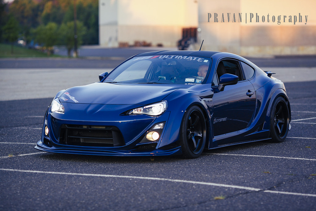
14900786081_d4a6d919dc_b.jpg

If you look at the above image...notice how the colors on the wide arches are the same as the ones on the side of the car, and how the reflections dont stop when a new panel starts...yes there is a dark line (shadow) between the panels but essentially the colors and shapes dont change!

Maybe that helped a bit...on your chop you have very light shades of blue on the wide arches and the bonnet but the side of the car is very dark...i hope i explained this in way you can understand! :-d :-d

Also the front bumper is a little warped...but the color is a bigger issue!
matt_193 say everything, so my suggestion is read his answer and next time try make chop better. Good luck
Check my profile on:
Facebook | Flickr | ArtStation | YouTube
vr8sdlzc.gif
Back to top

Please login to post