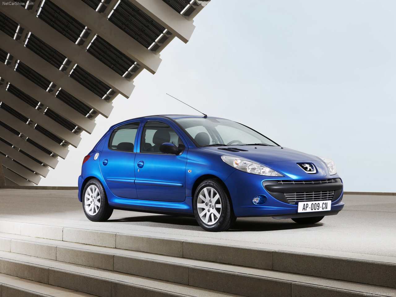
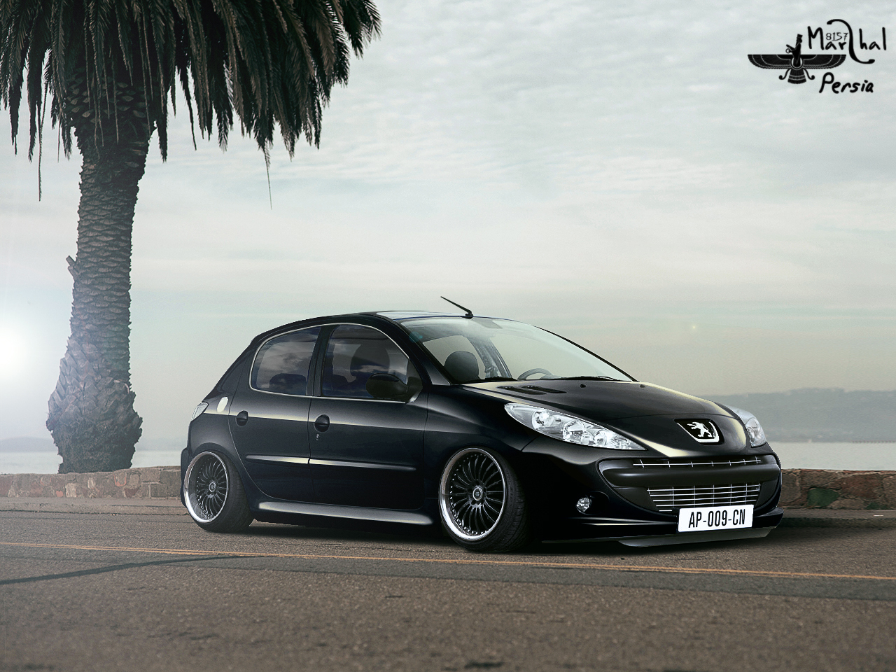
not bad actually looks great just small bugs.
1. That some kind of reflection in side windows is of looks like studio ref.
- if the windows are opened!!
- u have done ti wrong, interior should be darker windows brighter with white stroke on the edge of the window
-also if they are opened u have to follow original shape of the window
2. Imo it is slightly of angle, but nothing to be worried about
- that right headlight (on drivers side) should be transparent not solid color
- and also there are some bad cut lines around the roof
NO HARD FEELINGS M8


