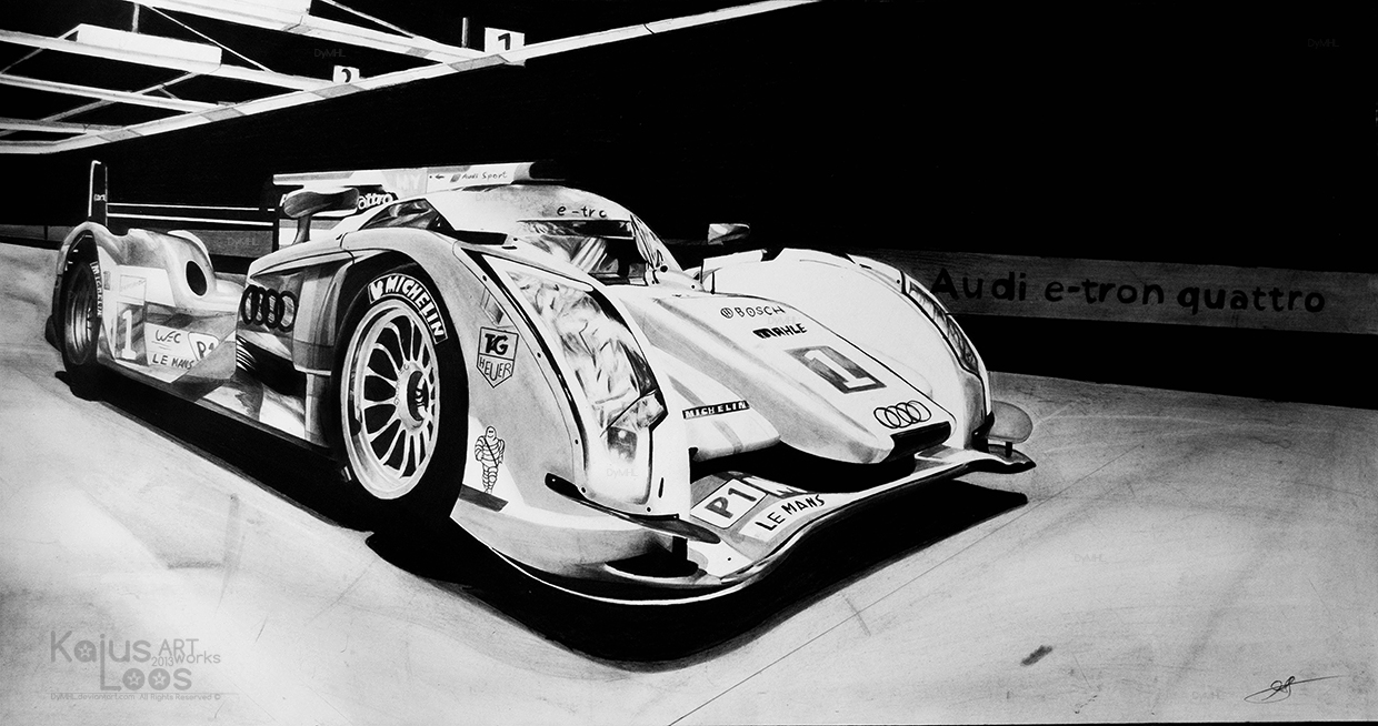
Audi R18 E-tron Quattro - Drawing
Hi!
My drawing of 2012 No.1 Audi R18 E-tron Quattro, I'm really pleased with it and probably this will earn a place up on my wall

Higher res: DA
Pencils - Staedtler Mars Lumograph (8B-2H), Derwent Graphic (2B, HB, H), Derwent Charcoal Dark (Used up almost whole pencil ), Faber Castell Mechanical Pencil 0.35mm B
Paper - Canson Bristol Extra Smooth - 65x34cm
Other Tools - Derwent Battery eraser, brush, blending stumps,blu-tack, Staedtler sharpener, erasing shield, fixative
More about tools I use HERE
Huge thanks to Alexis Goure for allowing me to use one of his picture of Audi R18 as a reference. Thank you!
Reference picture by Alexis Goure
Enjoy!
My drawing of 2012 No.1 Audi R18 E-tron Quattro, I'm really pleased with it and probably this will earn a place up on my wall

Higher res: DA
Pencils - Staedtler Mars Lumograph (8B-2H), Derwent Graphic (2B, HB, H), Derwent Charcoal Dark (Used up almost whole pencil
Paper - Canson Bristol Extra Smooth - 65x34cm
Other Tools - Derwent Battery eraser, brush, blending stumps,blu-tack, Staedtler sharpener, erasing shield, fixative
More about tools I use HERE
Huge thanks to Alexis Goure for allowing me to use one of his picture of Audi R18 as a reference. Thank you!
Reference picture by Alexis Goure
Enjoy!


