J_HUI wrote:
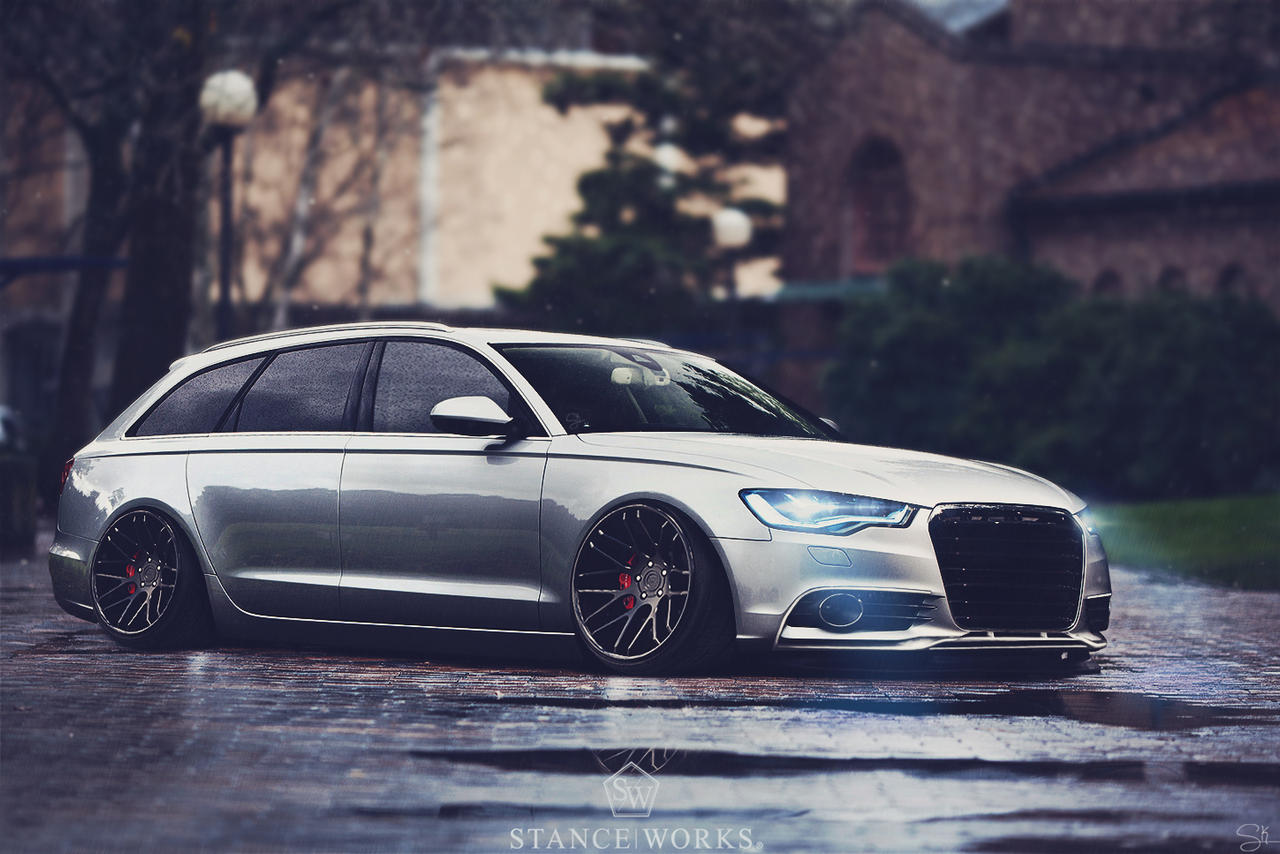
Seriously impressed with this chop, I saw this on facebook the other day and wondered who made this, Absolutely love the look of this Audi.
There is 2 things bugging me, im not 100% correct but I think:
-The rear wheels look smaller then the front, I would chop/ move the rear arches up so the wheels can be made bigger.
-I feel the perspective of the background is slightly off, the horizon should be lower, as right now the far back wheel is digging into the floor.

All up, great chop!

Thank you for the comment.

Could you give me the facebook link where you saw the car?

The wheels are not diggin in to the background, i wanted to add a bit more negative chamber on the back.
I didn't payed too much attention on the back shadow so that's why it looks like that. Im gonna fix that for sure.
I didn't touched the arches. It's the same distance from the original car. I slammed the car a bit more on the back that's why it looks like that. Another mistake.
I wanted to put the car a little behind to create the far distance effect but i didn;t worked enough with the blur at the base part ofthe background where i put the STANCEWORKS logo and mi signature.
I pasted the car exactly on the place where the original car from the photo was.
It was a little car. A MX5 Miata which is a very small car compared with this one.
But thank you for the comment and ill keep this in mind for the next projects to not repeat the mistakes.

Post edited April 15, 2013 at 11:23:54 AM by Sk1zzo


