Formula Student Concept

1 person favorited this.
Hi,

I'm fairly new to chopping, I've had experience in touching things up and creating compositions with 2D/3D.

This is slightly different, not sure if anyone here has heard of Formula Student but it's an engineering competition run every year where uni teams design, build and race single seater cars. As part of my thesis, I'm designing the aerodynamics for our car, and every design needs sketches before I go and CAD it up, and run some fluid sims.

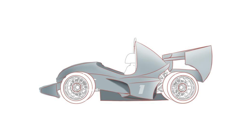
So the design is very much function over form, however being new to doing a completely 2D render (not going for photo-realism, more for using as a technical illustration) I need some help. I've started off with some lines (the grey technical stuff is from the CAD model, rendered out so my concepts are proportional) and some basic shading. The problem is I don't have a tablet, so how would I go about shading this so I can achieve something similar to the bottom image?

C+C Welcome ofc.
side1_zps7a4a6aed.jpg

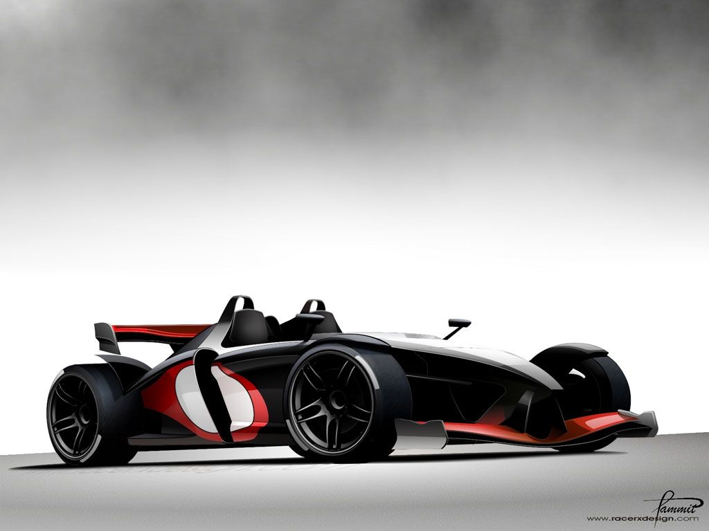
Target 'Look'
Racer-X-Design-RZ-Formula-1_zps514bed96.jpg
sig-1_zps5bbf69f6.jpg
Nice project :) wish you luck! I would use pen tool and after make some lines/shapes right click and make selection feather depend on the size of the image... Try to play with it ;)
77425267.jpg
Of course I know formula student! :D

The design is certainly one of the more elegant solutions that I've seen, and the target look seems to have been met even with the shorter wheel base.
Will be most interesting to see how the CFD data comes out when you've 3D modelled it, and whether such wings are worth it at the relatively tame speeds of formula student :)

So basically - can't wait - keep it up and keep us updated :)
Oh, and welcome to autemo :-d
125q72h.jpg
>>Latest Chop<<
| >>Like my Facebook Page<< | >>Basic Brushing Tutorial<<
Thanks! (Didn't realise photobucket added auto-resizing, will have to change image hosting site)

@Honza - Yeah that's probably the best way, make a lot of selections and try to use a mixture of gradients and a little bit of the brush tool if I can get away with it. :)

@ATC - =O :D

Haha, yeah the wings/no wings debate goes on for ages, this year in Germany, I think all the top ten enduro/autoX lap times were set with aero cars. They were pretty quick, and I think the designs are far more extensive than previous years.

Using a point mass simulator, we get about 2-3 seconds a lap down with aero. I think there may be more, because my initial CFD (no aero) show the wheels create lift so we can't corner as quickly, and there's quite a few areas where improvements could be made (may be only worth 1/10 s, but it adds up :mrteeth:) ~ I'll be looking how best to optimise the downforce vs drag vs cost.

I'll also try and keep it somewhat nice looking, I know Monash have a ridiculous looking car, but it works so I may have to compromise looks at some point. The target is more for how I want to shade the render, although it would be cool to make it like that, I think the shape of the chassis dictates that a lot.
sig-1_zps5bbf69f6.jpg
Well they say beautiful things perform best :-d
And wings always look cool so woop XD

Monash need a bigger wing tbh :awesome:
What uni are you building for anyway?

Anyway, back to the initial question you asked:
Anything you can do with a tablet, you can do with a mouse - it just takes longer. Until recently I've only ever used a mouse myself. But to go about shading it you'd probably want to make some selections with the pen tool for individual body panels or lighting areas, then grab the gradient tool, and use that to create the flowing colour on each panel

If you look at the "target" image, you'll notice that on each individually angled section of car, there is a gradient of colour flowing over it due to the curve and the way the angle of reflection is changing relative to the eye.
Now on your render, if it's for a more technical drawing, you may be best going for gradients which highlight the specific shapes and angles, rather than trying to create any actual sort of lighting - so literally using shadows for underside areas, and light bits for upper side areas. Obviously it's nice to have all the pretty imaging to accompany such drawings, but I guess that is just an added bonus that could come after
125q72h.jpg
>>Latest Chop<<
| >>Like my Facebook Page<< | >>Basic Brushing Tutorial<<
Haha, well let's hope so :mrteeth:

Thanks for the tips, I'll have a go as soon as these exams are done with. Well it'll be technical as in to help me describe my design ideas and to show sort of an optimising process (don't want to build a CAD model for each design) and to demonstrate flow paths ~ but that''ll be once I get the hang of this and for other views. Sort of like how the F1 technical sections look.

http://www.formula1.com/news/technical/2012/0/942.html

I think I will focus more on highlighting the features and curves rather than try and light it properly ~ if I get time I'll give it a shot, always looks nicer.
sig-1_zps5bbf69f6.jpg
Chose a different angle, not one with ridiculous curvature to it. Decided it's probably quicker for me to freehand sketch a design, then go to PS with it, however I've done this much so far, I think I'll continue with it as a learning exercise. Let me know what you think.

MPfhT.jpg
sig-1_zps5bbf69f6.jpg
Back to top

Please login to post