Fiat Palio Sportive
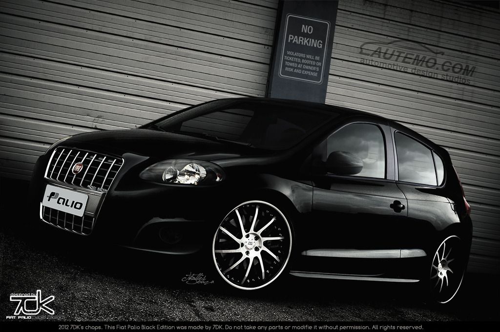
Different from what i usually do, I'll now post the chop first, then talk a bit about it. So here is my Black Edition Machine. 
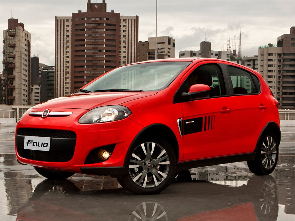
Original:
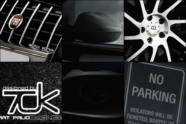
Details:
Chop by 7DK:
HR: http://img694.imageshack.us/img694/7217/palioblacktuninghr.jpg
Well, a bit about the chop: I decided to modifie this car, since its popular here in Brazil. I decided to work more on it, spending more time on details, looking for mistakes or bad things, brushed parts that could be improved and etc.
This chop is a mix of brushing and CopyandPaste. I used this Audi S5 donnor ahead to mod this chop:

About 75% of all this mods are CP from the S5 (but not purely CP'ed. They recieved mods (including brushed ones) to fit well the car) About 25% is brushing and the other 5% come from the original one.
Special thanks to MK211 for helping me, telling what could be improved, what was bad and that stuff, during the WIP.
Coments and votes are welcome.
Hope you like it!
Cheers,
"7DK"
Original:

Details:

Chop by 7DK:

HR: http://img694.imageshack.us/img694/7217/palioblacktuninghr.jpg
Well, a bit about the chop: I decided to modifie this car, since its popular here in Brazil. I decided to work more on it, spending more time on details, looking for mistakes or bad things, brushed parts that could be improved and etc.
This chop is a mix of brushing and CopyandPaste. I used this Audi S5 donnor ahead to mod this chop:

About 75% of all this mods are CP from the S5 (but not purely CP'ed. They recieved mods (including brushed ones) to fit well the car) About 25% is brushing and the other 5% come from the original one.
Special thanks to MK211 for helping me, telling what could be improved, what was bad and that stuff, during the WIP.
Coments and votes are welcome.
Hope you like it!
Cheers,
"7DK"
Post edited March 15, 2012 at 07:06:17 PM by 7DK


