Chopperkid44's Wips

Alright enough pussyfooting around. I'm making a wip thread cuz i jump wips A LOT until i find something that sticks and i work hard.

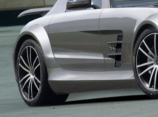
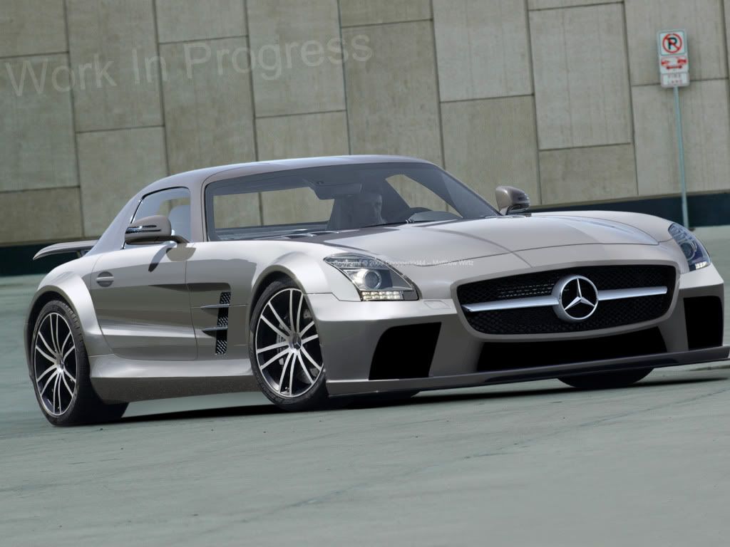
Well to kick it off, i apologize that i've taken up space with a previous SLS AMG and Mercedes C class touring. Nothing was working and stuff but after a few good hours of work, i'm proud to tease you with my wip of the new Mercedes SLS AMG "Black Series"

A clever mix from a black series donor on a new SLS. Most brush over the copy paste parts. Overbrushing is fun with this stuff lol

teaser1-1.jpg


teaser1-2.jpg
92% of the teenage population has moved on to rap. if you are part of the 8% that stayed with rock, put this in your profile
Show more, looks tasty.
autemochristmas.png
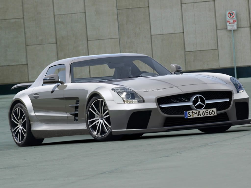
Update to the SLS AMG! Its not done but damn close. Some work to do is in the front. Design need tweaking and brushing needs more definition in places. This is 50% brush 50% copy paste roughly. Remember design is meant to be a Black Series SLS AMG Concept

Here's the original sorry for never posting
http://i194.photobucket.com/albums/z172/chopperkid44/Mercedes-Benz-SLS_AMG_2011_1600x120.jpg

teaser2.jpg
92% of the teenage population has moved on to rap. if you are part of the 8% that stayed with rock, put this in your profile
Nothing?
92% of the teenage population has moved on to rap. if you are part of the 8% that stayed with rock, put this in your profile
Needs to be a bit more extreme imo. It looks realistic but rather tame. I think the wheels and arches may be a bit small compared to the monster fb.
sigy.jpg
Needs to be a bit more extreme imo. It looks realistic but rather tame. I think the wheels and arches may be a bit small compared to the monster fb.
sigy.jpg
The fb ruins the entire chop, which is really sweet! The side is awesome, but then you see the front! The problem the way I see it is that the fb looks to wide, but you can change that optically by making the middle hole (with the merc logo in it) smaller, as well as trim the edges just a little. Cause now, optically, the front looks wider then the side, aside being GINORMAGANTUS! hehe. Otherwise very sweet! Keep it up :)
post-572-1270930804.png
post-572-1294695461.png
Algeroth wrote:
The fb ruins the entire chop, which is really sweet! The side is awesome, but then you see the front! The problem the way I see it is that the fb looks to wide, but you can change that optically by making the middle hole (with the merc logo in it) smaller, as well as trim the edges just a little. Cause now, optically, the front looks wider then the side, aside being GINORMAGANTUS! hehe. Otherwise very sweet! Keep it up :)

haha thanks for the feedback! You too mcflurry!

I'll fix up the front now i know whats wrong :P
92% of the teenage population has moved on to rap. if you are part of the 8% that stayed with rock, put this in your profile
Update! I know the front looks wide but its lined up the lines of the original car. I think this looks pretty close to finish


teaser4.jpg
92% of the teenage population has moved on to rap. if you are part of the 8% that stayed with rock, put this in your profile
looks good, not really my style but tis good xD
Back to top

Please login to post