Thanks man!!!
92% of the teenage population has moved on to rap. if you are part of the 8% that stayed with rock, put this in your profile
IMO.
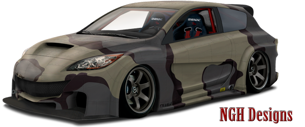
-The wheels have too much blue hue. So go to image > hue and sat and lower the blue a bit.
-The voltex side vent looks a bit flat.
-And I think the front wheel a bit too far forward, try moving it a bit backwards towards the rear, it might look a bit better.

But wow awesome chop matt, one of your best !!! :-d
ffkZ5K.jpg
Come join us on Facebook and Tumblr
Thanks j_hui!

Heres a small update. I found a slightly higher res interior so i fixed that up a bit. workied a lil bit on the vent but x-raited doen't see much wrong with it lol.

I'll tackle that color issue on the wheels. As for position. I can't move the front one back. The tire is at the back of that fender as it is lol. But i can see what happens haha

Pro maybe?

bgwiprender5wall.th.jpg
92% of the teenage population has moved on to rap. if you are part of the 8% that stayed with rock, put this in your profile
Better?

http://img299.imageshack.us/img299/4118/sidecropwip6.jpg
Post edited March 20, 2010 at 03:15:26 PM by Chopperkid44
92% of the teenage population has moved on to rap. if you are part of the 8% that stayed with rock, put this in your profile
Yes man, that skirt is 100x better than before. Looks like it has depth now and that was the only issue I had seen with it. I think you have a winner with this last update, its already my desktop wallpaper. I've saved myself a ton of references to start this comp...but after seeing this I'm pretty sure I want to just throw in the towel. Nicely done Matt. =O
autemosig.png
way better, great work with this. a big wing would be perfect.
good luck mate :-d
car town @ facebook
someone might be leaving the Intermediate club soon :D

imo the vent in the side skirt looks unrealistic needs less "black" in it

and +1 on a bigger spoiler

good luck m8
merccopy.png
www.shadow-designer.webs.com , www.shadowchoper.deviantart.com
Back to top

Please login to post