Global Rank: 0th (767pts)
Reg: Mar, 2020
South Africa
Global Rank: 0th (12291pts)
Reg: Aug, 2009
Finland
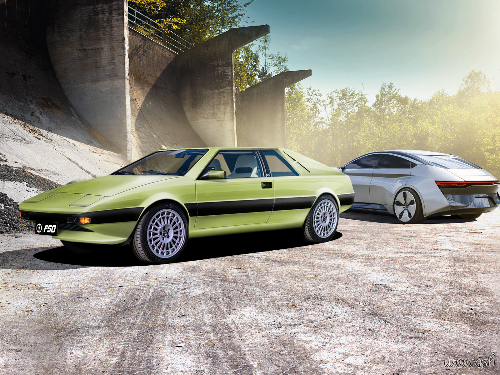
Basics are there in brushing, but in places it looks bit "basic" and "toony".
Also some stuff like wheels are visibly lower qualitywise. Also one tip I would add is to take close look in shadows. That "hard" shadow all around looks bit weird.
Nice work overall, funky base and cool color! Something you deffo do not see everyday
Also some stuff like wheels are visibly lower qualitywise. Also one tip I would add is to take close look in shadows. That "hard" shadow all around looks bit weird.
Nice work overall, funky base and cool color! Something you deffo do not see everyday
Global Rank: 0th (7131pts)
Reg: Aug, 2009
Hungary
Just as nordic said. But keep it up!


