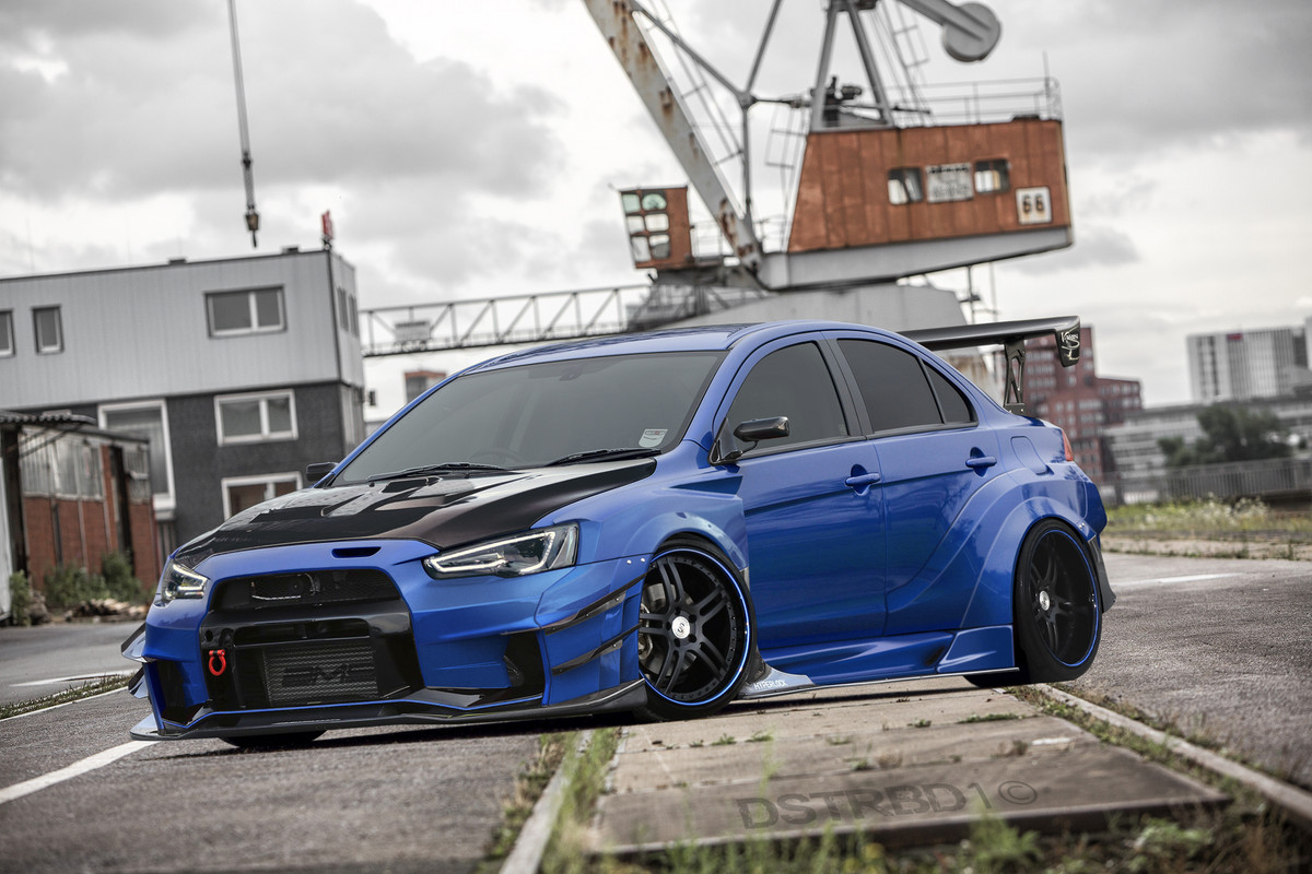
Lancer Evo X Varis Widebody

Hello!

Once again a chop lol, keep pushing them out since corona is giving me time to. This time I tried to recreate Varis' new widebody kit for the Evo X. I know there probably still are some issues reflection-wise, but I just wanted to call it finished, it took quite some time, and I'm quite happy with it. As the Mazda RX-7, this is one of my most drastically changed cars ever, maybe even more than the RX-7.

Base:
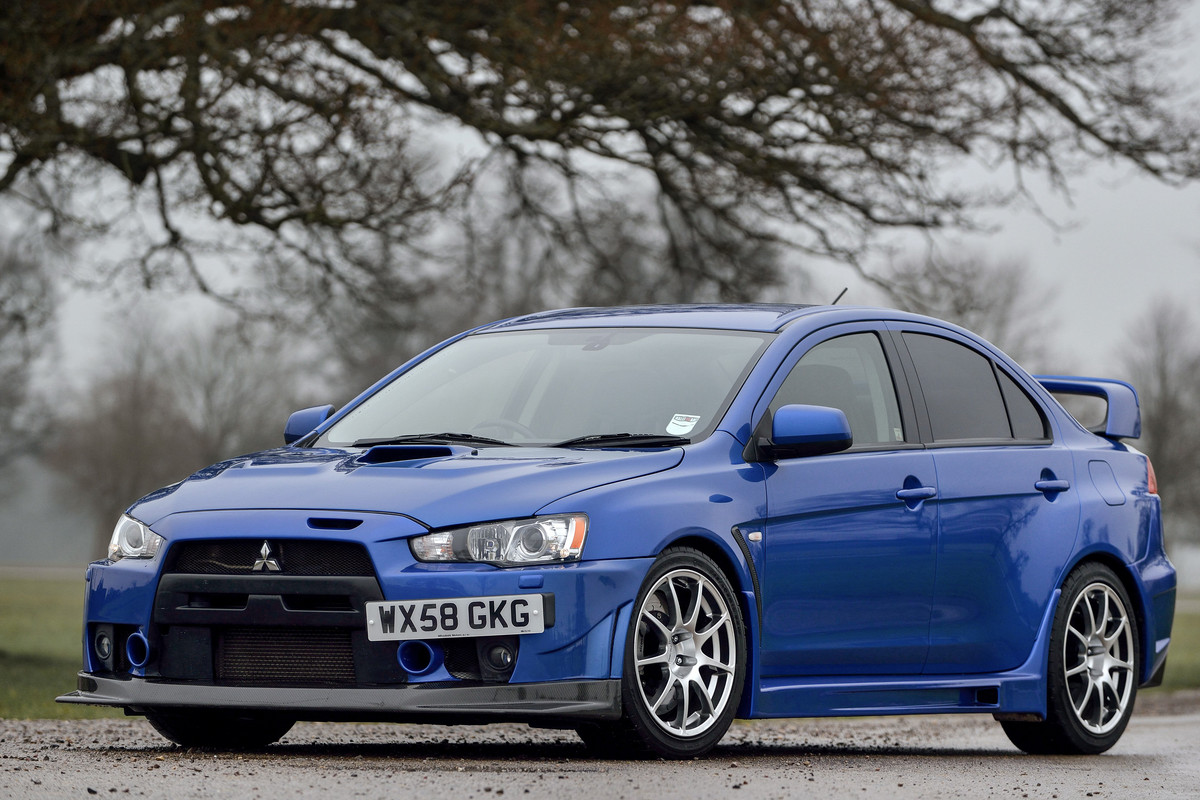
mitsubishi-lancer-evolution-x-fq-400-7.jpg

Chop:
Mitsubishi-Lancer-Evo-X-FQ400-Dstrbd1.jpg

HR: https://postimg.cc/TLyS7R08
gmm_skully.jpg
0.00 (0 votes)
Nice work.
Cool stuff!

Overall nicely made chop with nice bodykit! The biggest thing that catches my eye is that area under further headlight. You had such a nice reference to it on the base, yet it is still quite not so nice looking.
Good job starting to learn brush / widebody, doing more of this will get you going to do more complex stuff in the future. As an advice, you can start to mix and match various different kit elements from other cars for a mode "different" look, rather than using the same donor for everything :-d
thanks guys!

@LKN: I have mixed up parts and kits in the past, and I will again, but this time I really just wanted to recreate this particular kit as a whole.

@nordic man: I know that part looks bad, I tried to get it better but only made it worse so I kept it like this
gmm_skully.jpg
Looks amazing issues have been listed above but i love the style and the eirk is generally clea
n ^^
Redz Design
AKA : EPYON
2 people liked this.
Stylish chop man, was not disappointed from the wips I saw on chat! :D

The admins wanted to promote you to pro for this, but I'm being a jerk and have a few things to point out that I just want you to be cautious of for next time. Small areas to focus on and you'll be sure to be in Pro!
https://live.staticflickr.com/65535/49812102241_2774ec0574_3k.jpg

Apart from that, I want to see what 'atmosphere' ambience you can create becasue I know you do amazing work. Try and play around with making water puddles, rain drops, lens flare, sunsets, explosions, creating your own backgrounds.. etc. Get creative!

To give you an idea about my editing process:
https://live.staticflickr.com/65535/49812139341_dc614e1749_h.jpg

Hope to see you step it up on the next chop and give me nothing to pick on!
ffkZ5K.jpg
Come join us on Facebook and Tumblr
J_HUI wrote:
Stylish chop man, was not disappointed from the wips I saw on chat! :D

The admins wanted to promote you to pro for this, but I'm being a jerk and have a few things to point out that I just want you to be cautious of for next time. Small areas to focus on and you'll be sure to be in Pro!
https://live.staticflickr.com/65535/49812102241_2774ec0574_3k.jpg

Apart from that, I want to see what 'atmosphere' ambience you can create becasue I know you do amazing work. Try and play around with making water puddles, rain drops, lens flare, sunsets, explosions, creating your own backgrounds.. etc. Get creative!

To give you an idea about my editing process:
https://live.staticflickr.com/65535/49812139341_dc614e1749_h.jpg

Hope to see you step it up on the next chop and give me nothing to pick on!

I see what you mean, besides the donor tyre then, but that might just be my screen settings? Cuz I zoomed in and still can't see the tyre not blending, but you're right about everything else tho. I was aware that it still was far from flawless, but some parts I made worse instead of better so I left them alone :P I'll keep your remarks in mind for the next works :D
gmm_skully.jpg
Back to top

Please login to post