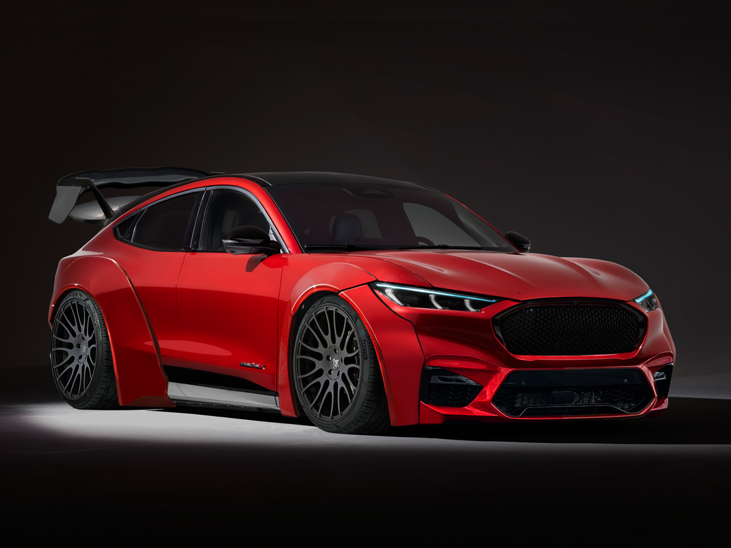
Looks pretty promising! I'll give some bulletpoints for improving from this current state.
  • The Color on the M5 bumper swap is a bit off, I would suggest playing with the hue & saturation until it matches the color of the car
  • Wheels seem too dark? Maybe add some brightness to them. If this were me I'd also fix(?) the fitment of that front wheel by spacing it out a bit to match the rear wheel.
  • Spoiler seems off. I'd suggest lowering the brightness and lowering the saturation as well.
  • Maybe lower the brightness on the front fender flare a bit? Particularly in the front section. If I look at it for too long it seems a bit off.
  • Add something on the right side of the car. I feel like the fender flare should be partially visible on the other side of the car as well.
Join my discord server!
WIP 6
FORD-MUSTANG-MACH-E.png
If you plan to keep it in showroom, get rid of the cloud reflections on the added parts.
Otherwise agree with Hexaflux.
nordic man wrote:
If you plan to keep it in showroom, get rid of the cloud reflections on the added parts.
Otherwise agree with Hexaflux.
I fixed everything Hexaflux said :)
Elektro Design wrote:
nordic man wrote:
If you plan to keep it in showroom, get rid of the cloud reflections on the added parts.
Otherwise agree with Hexaflux.
I fixed everything Hexaflux said :)

Yeah you are correct. I had to open both images side by side to actually see everything to be honest.

But still, there is something bit weird with the wheels lighting. Not sure what more to do with them.
Back to top

Please login to post