Voting - Last of Us - Round 6: Dodge Charger Daytona 17'

1 person favorited this.
Here are the votes of round 6. Voting is up to 25 August 2018 >>>Countdown <<<

You have to vote like this:

7 points - aaa
6 points - bbb
....
2 points - fff
1 points - ggg

If you want you can motivate your vote.

I remind the participants that they must vote to receive the 10 bonus points and do not create differences between those who vote and those who do not vote.

TOP
29898678668_8994f907ef_o.jpg
HR: https://c1.staticflickr.com/1/931/29898678668_8994f907ef_o.jpg

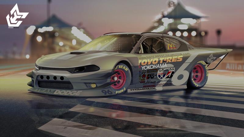
IrFaan
Ya_YO4_JH.jpg
HR: https://i.imgur.com/YaYO4JH.jpg

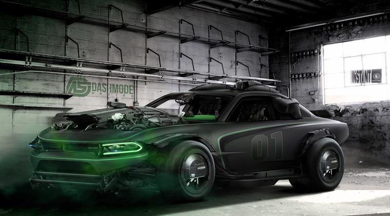
dashmode
Charger.jpg
HR: https://image.ibb.co/g5442e/Charger.jpg

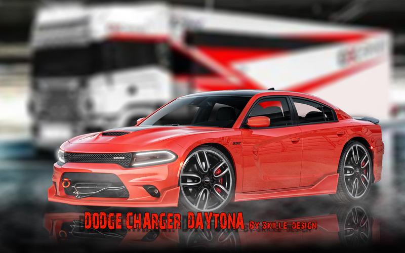
Skille Design
n0_Ipt_L1.jpg
HR: https://i.imgur.com/n0IptL1.jpg

Vinyo
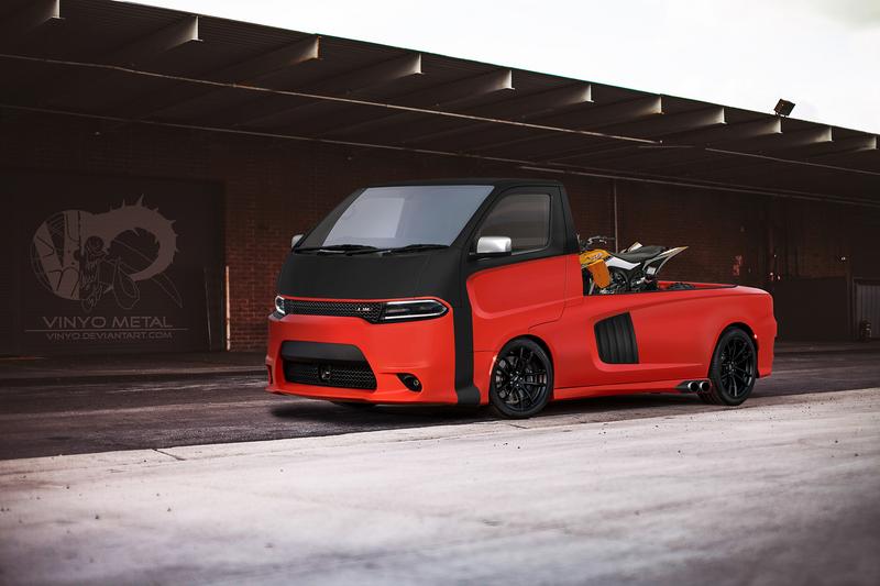
vu_EFQE2.jpg
HR: https://i.imgur.com/vuEFQE2.jpg

Silvano Jose 21
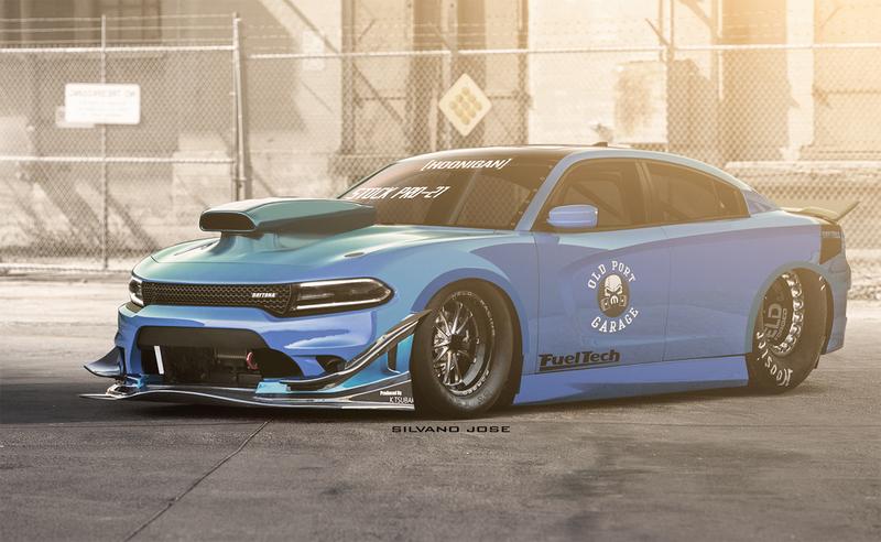
dodge_drag_art_speed_by_Silvano_Jose_21.jpg
HR: http://www.autemo.com/dc/users/5/OS0F3/10988/chops/dodge_drag_art_speed_by_Silvano_Jose_21.jpg

Outlaw
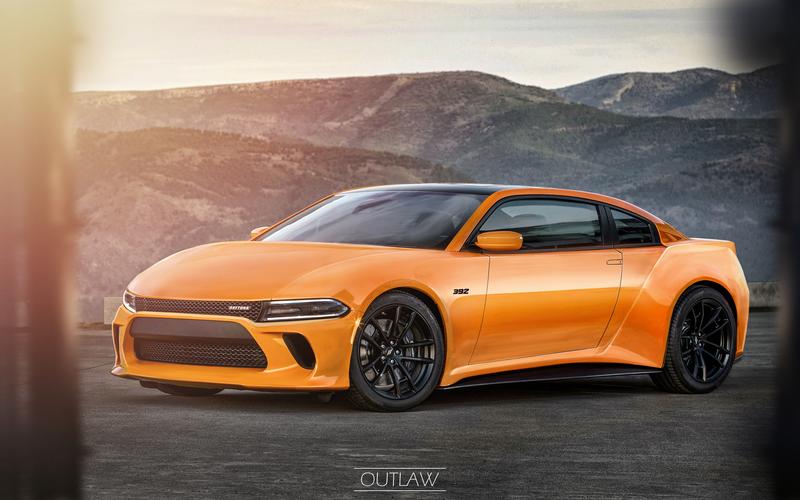
K7if_RHZ.jpg
HR: https://i.imgur.com/K7ifRHZ.jpg
Post edited August 24, 2018 at 02:19:27 AM by ddd racing
7 points- TOP
6 points- Outlaw
5 points- dashmode
4 points- IrFaan
3 points- Vinyo
2 points- Skille Design

Good work from everyone. :mrteeth:
7 dash
6 silvano
5 outlaw
4 vinyo
3 skille
2 top
1 irfan
1 person liked this.
I am very happy to review this comp with more than 3-4 entries :omg:

My votes:

7pts Outlaw
6 pts TOP
5 pts Vinyo
4 pts dashmode
3pts Silvano Jose 21
2pts IrFaan
1pt Skille Design
1 person liked this.
7 pts dashmode - Typical, great ideas some small issues.

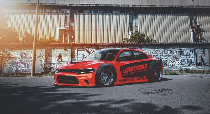
6 pts TOP - Not too many changes, but just enough, and perfect.

5 pts Outlaw - I like the idea, but i can't feel the shapes. The front is deformed and the back is too GT-R-ish.

4 pts IrFaan - From waay tooo faaar, it's a great chop good ideas and shapes, but when i look closer: the wheels are falling off, there are sharp edges on the front, and the whole interior is not fitting.

3pts Silvano Jose 21 - I like the drag theme, but i feel like, this pic is only half done. Some parts are just falling off the pic, because of the huge color differences, and half brushed parts. What is that wing back there?!

2pts Skille Design - I really don't know what to write. Spoilers are to edgy, and you can't open the back doors. Wheels are 2D. Sorry mate... but keep it up and practice!
http://vinyo.deviantart.com/
https://www.instagram.com/vinyometaldesign/
2 people liked this.
7- Top because you can still see its a Daytona
6- IrFaan like the mean look
5- Dash cool car but I am not a fan of the wheels
4- Outlaw like the two door plan but nose to rounded
3- Silvano Jose nice idea on chop but color and incomplete for me
2- Vinyo Not a fan of the delivery van sorry !
River Post Projects
7 goes to TOP
6 goes to Irfaan
5 goes to Silvano
4 goes to Outlaw
3 goes to Skille
2 goes to vinyo
7pts TOP
6 pts Outlaw
5 pts dashmode
4 pts Silvano Jose 21
3pts Irfaan
2pts Skille Design
1pt Vinyo
gmm_skully.jpg
2 people liked this.
7 pts TOP - really cool design, its subtle compared to some of the chops here but really love the liberty walk design elements and the over all look of the chop!

6 pts dashmode - another super cool chop from you, the whole "transformers" style design elements you add to your chops really is your own unique style!

5 pts Vinyo - yay finally a new chop from you XD your chops have always been cool, and from a quality standpoint you actually have the best chop here!!! i love the small touches and the cleanness of the chop, its just he design choice that seems have let it down. awesome work and i hope you post more!!

4 pts Outlaw - now that is a cool design!! i love the super-car twist to it, the shapes and i can really see where you were going with this ^^ the issue is when you load up the higher rez you can really see alot of rough brush, and gives it a very unfinished look.

3 pts Skille Design - this reminds me alot of my own chops XD i actually love the look of it, i can see you are really trying to work with brushing and the atmosphere, just try to ease of a little on the background blur, and if you can, try to add the blur in layers IE: further items have more blur then closer items ( it will give you some awesome depth)

2 pts Irfaan - Keep up the awesome work, i can see some really cool art elements in this chop, you have worked on the colour composure and lighting nd i can tell, the brushwork is good but only when you go high rez do you see all the jagged edges and mis-aligned design elements ( the wheels for example) keep up the work though you are only getting better.

1 pts Silvano Jose 21 - your chops are always awesome and you always have really cool designs,its just that this chop just seems unfinished lots of bits missing and colour related issues ( i dont blame you as i didnt even start it yet XD)
Redz Design
AKA : EPYON
7 pts TOP
6 pts SilvanoJose
5 pts Irfaan
4 pts Outlaw
3 pts Vinyo
2 pts Dashmode
1 pts Skille
Check my profile on:
Facebook | Flickr | ArtStation | YouTube
vr8sdlzc.gif
Back to top

Please login to post