Daihatsu Terios / Toyota Rush 2011
Hello, welcome again..
So this project actually started from 2012, but unfortunately due my lazyness it just finished on today, 2018
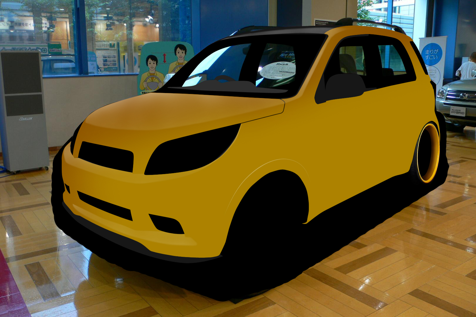
So the base actually here.. Found on 2012-ish

And the work (not immediately) has been started.. It's 2014 lately.. At first my planning is to make some fancy stanced car.. Without any intention to made it race-greedy car as my preference

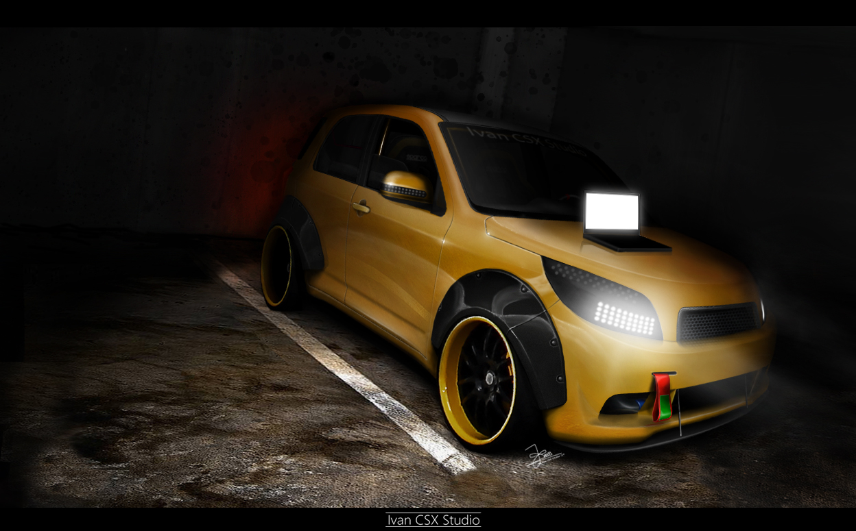
On 2016, i get a background donor that I think it closely fits, but then I missing the ideas again and too lazy to continue haha

But finally on today, 2018 it's finished but with lot of reworking (because I've got a loooot of ideas and try to make like 2018-ish style haha)..

I know the resolution not so big as I not really resizing the whole image..but yeah, that's really my personal achievement to finish what I've started..
C&c are welcome anyway
So this project actually started from 2012, but unfortunately due my lazyness it just finished on today, 2018
So the base actually here.. Found on 2012-ish

And the work (not immediately) has been started.. It's 2014 lately.. At first my planning is to make some fancy stanced car.. Without any intention to made it race-greedy car as my preference

On 2016, i get a background donor that I think it closely fits, but then I missing the ideas again and too lazy to continue haha

But finally on today, 2018 it's finished but with lot of reworking (because I've got a loooot of ideas and try to make like 2018-ish style haha)..

I know the resolution not so big as I not really resizing the whole image..but yeah, that's really my personal achievement to finish what I've started..
C&c are welcome anyway


