HQ images are a MUST in chopping, and if scrolling on the image is an issue then i have no words to say...
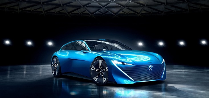
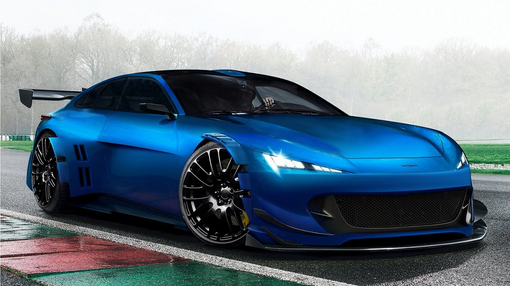
About the chop, well its not a bad concept actually, but less can be way more sometimes! And this is surely the case here! The widebody parts that you made a seriously blurry and smudged all over the place...the carbon on the front new c/p parts looks weird! The front wide fender looks like it doesnt belong on the image, the body is all smooth but the fender is pixelated! The wheels have great quality...but have completely different lighting and contrast to the car! Either the rear wheel was pasted horribly or the widening around it is out of shape but the rear end looks very messy...also the smudged look applies here too! The colors of the whole image dont match...you went from an indoor lighting image to an outdoor image and to change the lighting you just smudged all the highlights away hoping it would fit...well it didn't...tryusing reflection of the image to make it more realistic...there is a forest in the bg that you couldve used, or the tarmac of the track, the kerbs...lots to choose from! Details but they would improve this chop a lot!
sorry this for me is max 5/10...you did a lot of work but almost all modifications were done with faults...
