VW Scirocco --> Skies

Hi guys,

this is my last chop, it's very simple but I like the result :)

I hope you like it

base..
volkswagensciroccor2010.jpg

chop..
sciroccoblu.jpg

as always c&c are welcome ;)
firmaskies.jpg
0.00 (0 votes)
This is a very stylish chop, I really enjoy the new look you have achieved. The CF looks pretty nice, and the wheels are a good match for the car. Just a couple issues, somewhat minor to take it to that next level.

First the windows look a little flat now that they are tinted. This could be resolved with some reflections, to really make them pop.
2nd) While the wheels are a great match for the car, the front one seems a little too large. If you look closely not only does it not fit well into the fender, its a little larger than the rear.

Last thing that is somewhat minor is the sharpness of your ground shadow. It's just a little too sharp and needs to fade some to make it look more realistic.

All in all I really like the car, would love to have something like that as a daily driver. Keep it up :-d
autemosig.png
first of all I really appreciate your comment and advices :D
you're right for the windows, I completely forget to add some reflections xD...for the wheels I'll try to adjust the front :-d
thanks man!!!
firmaskies.jpg
Really Does Look Awesome! From the Style to The Stance
I Totally Agree with Luke, Especially About the Shadow
Keep it Up Mate :-d
1492ump.png
further on the windows , imo the front window should never be tinted , and on the wheels , the rear wheel seems to be tweaked to the side a little bit , you need to take the left side of the wheels and crop it inwards , just a little bit , to make it look like the wheel is parallel the body
sighf.jpg
It's a very cool chop. You've gave the scirocco a whole new look (in a positive way).
But I would like to see a bigger resolution, because it's now a pretty low res to judge.

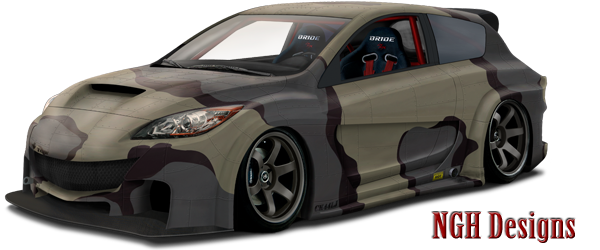
The cf hood looks pretty cool, it's good executed. Also the new vent in the hood is a nice touch. You have (almost) no changes to the fb, but it does fit the style of the car perfectly. So it was a good thing to keep the frontbumper standard. The darker lights do fit the dark hood very good, it makes the car look more agressive! :)
The wheels look very good too. But the rear one is jagged. This could be due resizing the pic. But the front one looks a bit blurry. It's also a bit too big. It should be very hard to turn now. Just one or two inches smaller would make a whole difference.
The undercar shadow looks good, but it's a bit too sharp. You could try to gaussian blur it, would look way better.
The windows could use some more reflections, they are to matte now. Just some cloud refs would make already a whole difference. But don't set the oppacity of the window refs too high, because it wouldn't look pretty realitic animore then. Just play a bit around with the oppacity of the window refs :)
The car does fit the background very good, I must say. Also the darker lights ant the new rearbumper are a very nice touch!

overall it's a very good chop, keep up this kind of chops!
aetoq8.jpg
My dA
nice ideas and cool look
to bad you did something witch degraded the whole pic quality it look kinda blurry and grainy now
next time try to avvoid that :-d
mijnlogo.jpg
thanks guys for all of yours comments :-d
firmaskies.jpg
woooooooooow nice chop!
I like!
But the dimensions are small!
I Love Japan Style!!

Sorry for my bad english....
Back to top

Please login to post