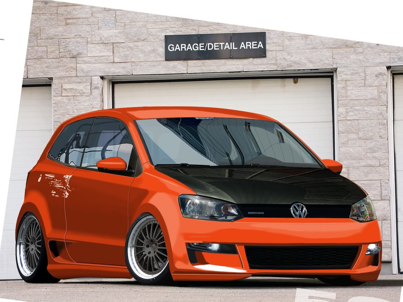
2010 VW Polo WIP

I feel like I am posting this WIP a little early, but I am looking to get an outside eye on these front bumpers. I'm having a hard time getting it to feel like its matching perspective to the car.

The plan once I'm happy with the lines and additions of the car is to rebrush the whole thing and plop it in a new BG. So anyway heres the wips I have....what do you think

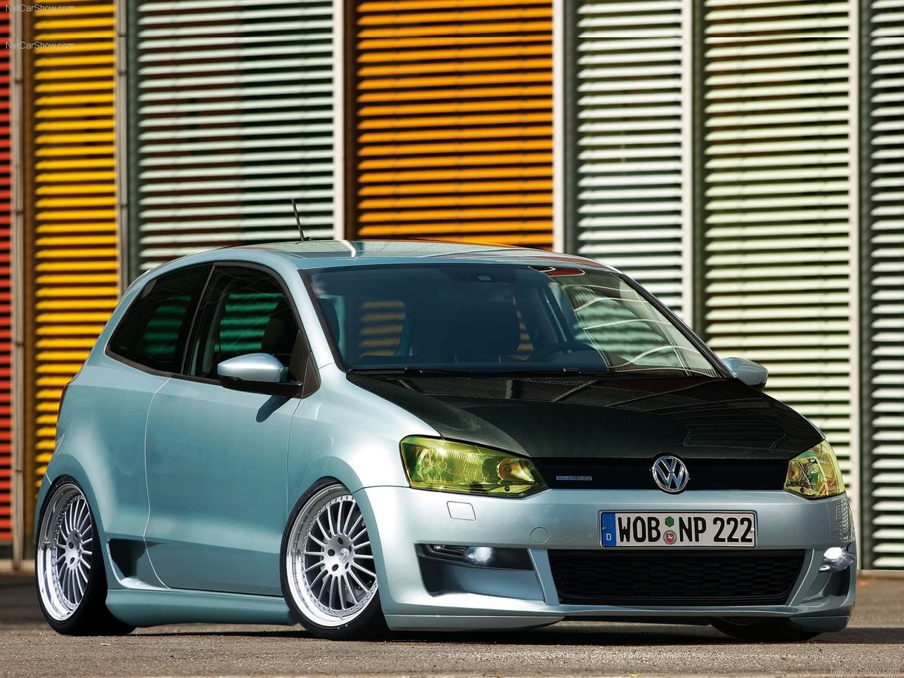
Orig:
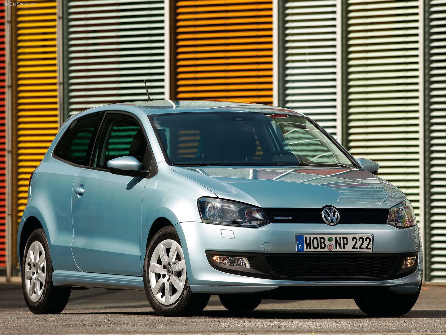
Volkswagen-Polo_BlueMotion_2010_160.jpg

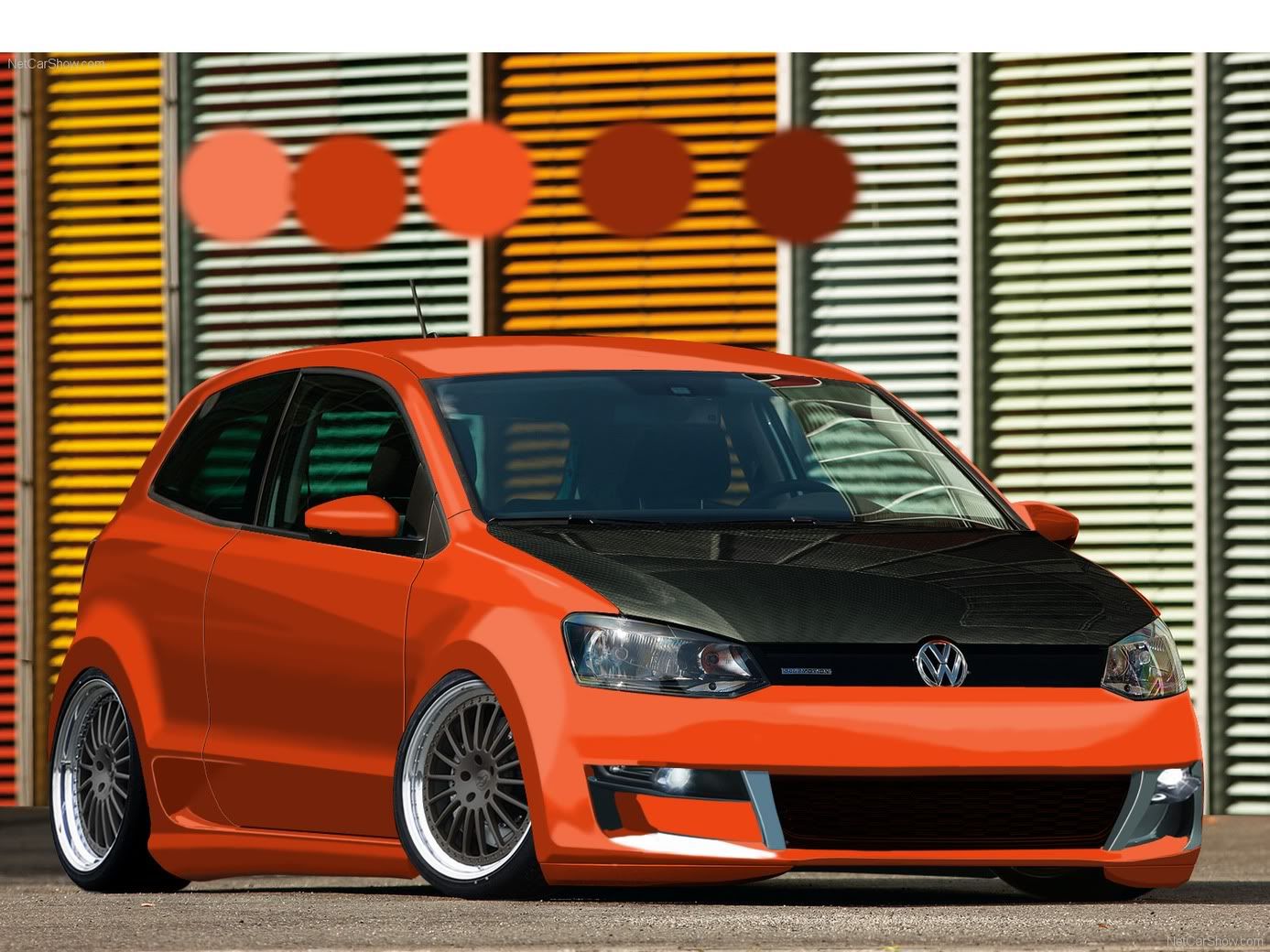
WIP #1:
2010PoloWIP-1.jpg
Hi Res: http://i24.photobucket.com/albums/c2/lukej6009/2010PoloWIP-1.jpg

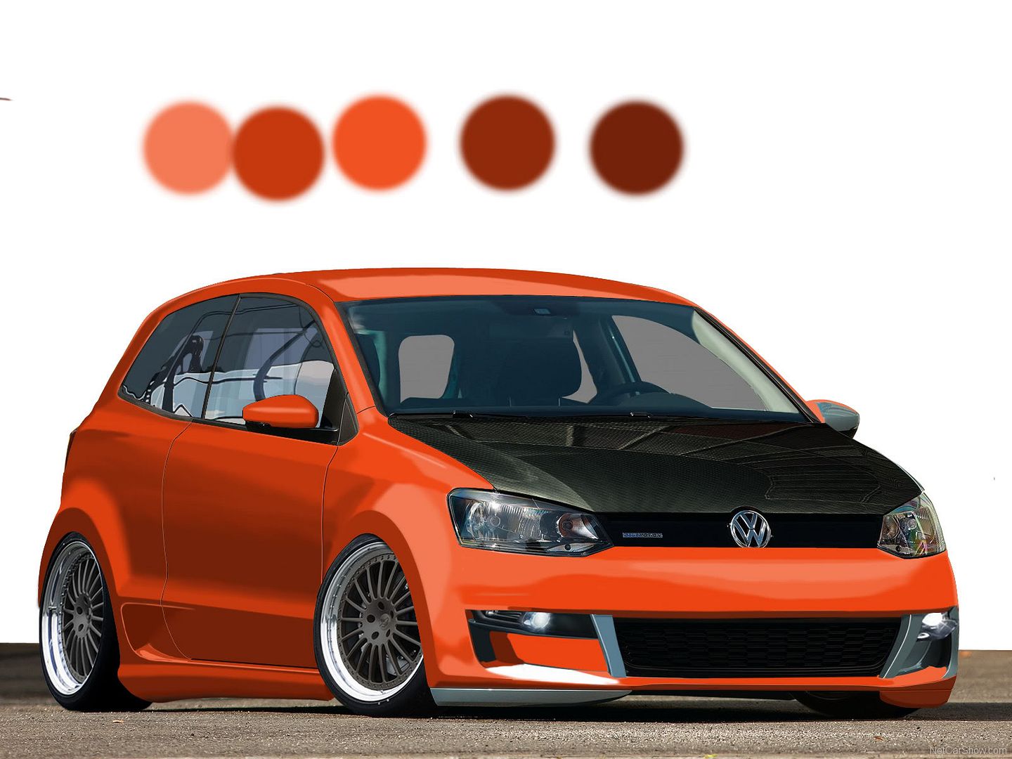
WIP #2:
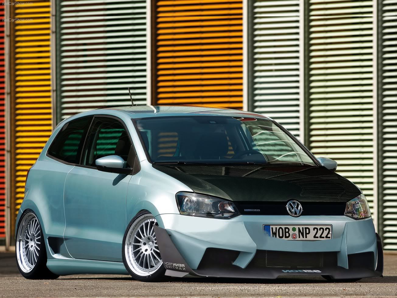
2010PoloWIPseibonbumper-1.jpg
Hi Res: http://i24.photobucket.com/albums/c2/lukej6009/2010PoloWIPseibonbumper-1.jpg
autemosig.png
In wip2 the front is differnt on the right and left side. Dunno what the theme/style is, but the title sugest a conceptcar, or a facelift of the original, or a sportsmodel. Therefore I think WIP1 would be great. Looks racey but still not being over the top. The secone one is a bit to extreme. The carbon hood feels more after market as well.. might wanna rethink that somehow :)

Cheers!
post-572-1270930804.png
post-572-1294695461.png
Ya, I've been thinking that number 2 was more aggressive than I am going for. Plus it was mostly a C+P from another car...whereas #1 is minimal C+P so far. Hoping that I got somewhere in the ballpark for perspective on the FB. After starring at it for too long my eyes were messing with me and nothing I could do made it seem like things were fitting well in front. I think part of my problem might have been the drinks I was having too :/
autemosig.png
Haven't spent too much time with it today...but while I was babysitting my smoker with a 25lb turkey in it I messed with it some.

Front wheel seemed a bit too crooked so I brought it in some, trying out a yellow tint to the headlights (still unsure) and touched up a few other random things.
2010PoloWIP2.jpg
Hi Res: http://i24.photobucket.com/albums/c2/lukej6009/2010PoloWIP2.jpg :mrteeth:
Post edited November 27, 2009 at 05:25:49 AM by Luke_Jones
autemosig.png
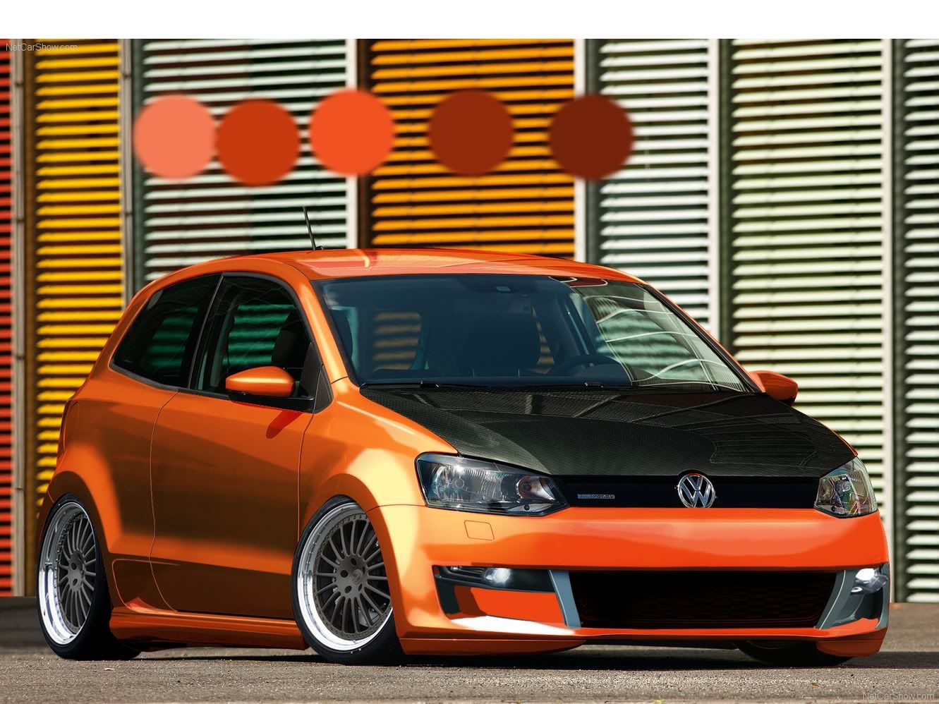
Spent some more time on it today. Starting to rebrush it, just found a new BG so I can finish the brushwork and start on some reflections and shadows. What do ya think so far?

2010PoloWIP35.jpg
Hi Res:http://i24.photobucket.com/albums/c2/lukej6009/2010PoloWIP35.jpg

For fun I tossed on an overlay of the original to give it some temporary reflections. It wont be staying this way though.
2010PoloWIP35-1.jpg
autemosig.png
Minor update, got the reflections brushed on the side windows and brushed out the old windshield reflections in preparation for the new ones.

2010PoloWIP4.jpg
Hi Res: http://i24.photobucket.com/albums/c2/lukej6009/2010PoloWIP4.jpg
autemosig.png
Looking great ! Cant wait to see this finished!
signaturesw.jpg
Thanks. I still need a little work on the shading of the car and reflections, but here's the latest. The large white are on the windshield is bugging me, it doesnt feel as real as the rest of the windshield reflection, but maybe its just me.

Anyway thanks for looking, comments are appreciated. This is the most brush work I've done so far on any chop.

2010PoloWIP5.jpg
Hi Res: http://i24.photobucket.com/albums/c2/lukej6009/2010PoloWIP5.jpg
autemosig.png
I think the chop looks good so far. Some warnings for you though!

First the highlights are way to strong in places, like around the airintake on the side of the car. Go over it with the eraser set to a rather low opacity and blend it in a bit more. Then go back and add some brighter areas on (highlights again) on the lower left corner of the airintake. Also I think you should move the highlight line 1 pixelrow up on the top part around the hole. Looks like the typical effekt there which you get when the line is half on the paint, and half in the hole. Makes it look smudgy. Try to move it up a little.

Then the paint... it's looks great, but looking at the windows, and the color they have I can't help but think that you need more cyan and blue in the paint? Those refs look very cold, and the paint is really warm in the colorscheme... Should try to even that out. Probably by adding more cyan and blue to all the highlights. The white reflection down on the Fb for instance should probably have the color of that cyanwhitish stripe you complained about in the windshield.

Overall it's looking good. One of the cooler Polo chops I have seen :) Keep at it!
Cheers!
post-572-1270930804.png
post-572-1294695461.png
all finished I think. :)

http://www.autemo.com/forums/?t=1662
autemosig.png
Back to top

Please login to post