Mercedes SLS Black Series

Well its finished in my opinion! Look out on worldcarfans.com. It just may be their leak for the black series ;)

Disclaimer! Styling isn't for everyone haha. Its meant to mainly be the SL63 Black kit on the body lines of the SLS. Its supposed to be fat and low like pagani. That was sorta my trigger on "holy crap" this could look badass!

Well enjoy, the front was a bitch so idk if its absolutely perfect but i need to move on. More school work coming in the next 2 weeks :(
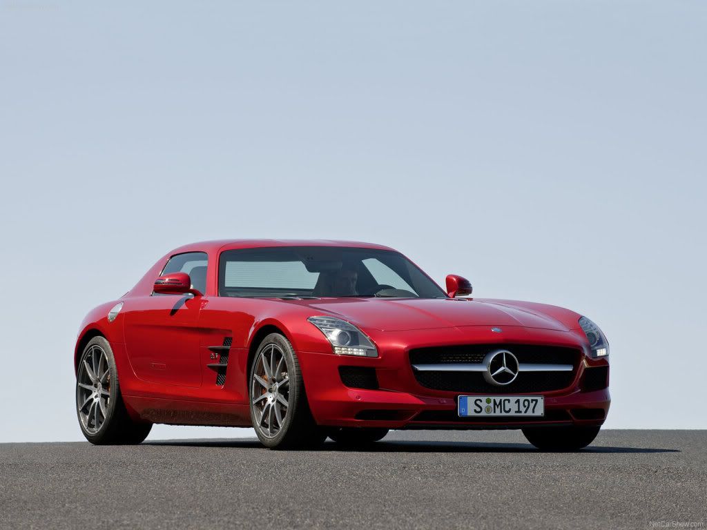

Original:
Mercedes-Benz-SLS_AMG_2011_1600x-1.jpg


Chop:
Black_series_sls.jpg


High res:
blackseriessls.th.jpg
92% of the teenage population has moved on to rap. if you are part of the 8% that stayed with rock, put this in your profile
0.00 (0 votes)
I like it,but front is a little bit too wide.
who i saw the wip yesterday but it came out way better then i expected , i agree on the fact it look way to wide , proportions wise the car is not pretty , it looks way to bulky

i know you said it where the same dimension , but often when changing a design you just have to follow your eye and not the ori dimensions

but not bad :-d :-d
mijnlogo.jpg
that kit looks more like it should belong to the "real" black series, since it fitted it's shapes better

apart from that,there is few other areas i spotted
the arches connecting the body aint blended properly, looks like the paint is worn out to matte next to them, and also toonyness in the newly brushed areas
also the interior isnt blended properly, since it has some grain on it, and the sidewindow stands out, as it looks like there aint "glass" on it exepct for tiny bit

must admit that this is not my favourite chop from you tbh, but it aint bad neither, since otherwise it is pretty nice
keep it up
Very nice chop, cool design.
But partly toony and I´d prefer the originial rims.
You know you wanna click it!
Signaturbig.jpg
Great work! Nice design! I just think this FB need some reflections. :-d
signature-2.png
Hehe, I understood that you just wanted this to be over with, but there are still some places on the front that need a little bit of work. But never mind. I like this chop :)

The front may look wide as hell, but so does the original, and maybe you should have taken that into considoration when designing it, but the black series fenders and such looks somewhat the same for the two black series that are out there, so there wasn't that much to go on there. Regarding the tonyness I only see it in the fb. The car has a color which allows for refs to look like this, and I think it looks like a real promotional picture for the car, something that mercedes could release themselves. Usually when carmanufactureres realse pics like this they rebrush out reflections and highlights, I don't know why :P They sort of go the oppisite way from us choppers that like to add gloss instead :P

Anywho, I really like the chop and look forward for your next work. Would have been nice to seen a bit better fb, but I guess you don't quite see what I see there, so :) I could be wrong. hehe.

Keep up the good work! :)

Cheers!
post-572-1270930804.png
post-572-1294695461.png
cool chop, good brushing
the fb still needs some work to it, keep it up
Thanks guys. Guess it could still use some more work i guess....
92% of the teenage population has moved on to rap. if you are part of the 8% that stayed with rock, put this in your profile
Back to top

Please login to post