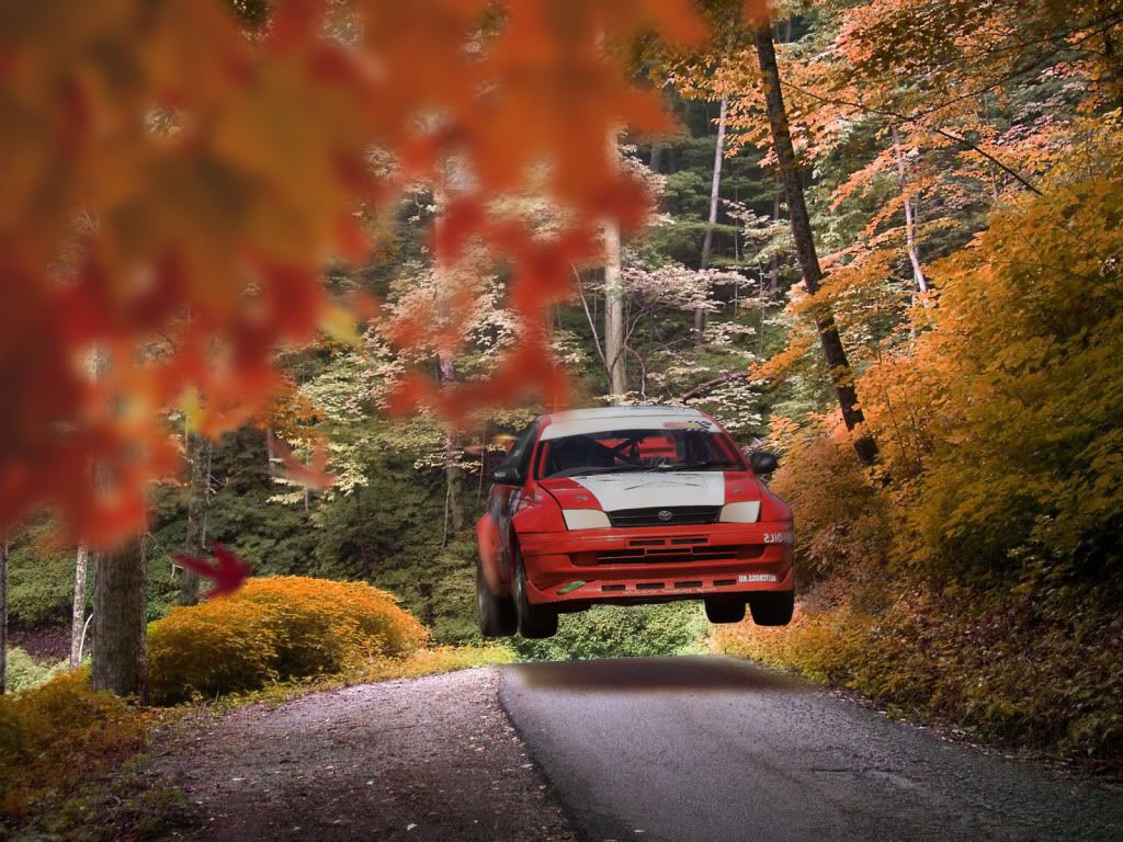
I feel, the car is too dark....
But nice... :-d
13161835.jpg

Please come and like this page if you likes my comment and post...
http://www.facebook.com/pages/CZdesignworks/101254286656476?sk=wall
+1

I prefer before :/

But you can add just 4 or 5 leaves at the top and at the left which are falling
Thanks guys, glad you like it :D
But yeah, will be making the car a bit lighter :)
Im not afraid to get dirt, oil and grease underneath my nails. I don't just pretend to like cars, I love cars.
I have a small update on this..
Got some more leaves falling, and on the rear of the car I have them like they're flying from the car.. Hopefully adds some realism to it. Also added some motion to the car, don't know it it's visible :L

Got some plans for adding some to the ground.. But don't know yet :D
Well, here's what it looks like so far. I am still in the process of removing some of the decals :)

Carina5.jpg
Im not afraid to get dirt, oil and grease underneath my nails. I don't just pretend to like cars, I love cars.
I think that those leaves in the front of the image, doesnt fit whit the idea, maybe you should make it a little smaller
EduSport wrote:
I think that those leaves in the front of the image, doesnt fit whit the idea, maybe you should make it a little smaller

Now you mention it, they do look a bit big. I will make them smaller, and then will see what they look like :)
Im not afraid to get dirt, oil and grease underneath my nails. I don't just pretend to like cars, I love cars.
Back to top

Please login to post