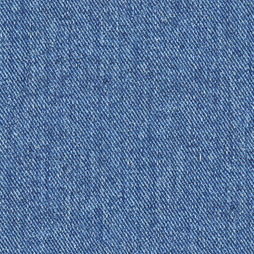
It doesn't look bad to me. It looks just a little messy because of how small the denim texture is. Scale the texture a little bigger to make it more understandable. If anything, your UV layout looks ineffective. If you are going to put every surface of the model into the same texture you are going to have hard times adding them all with this because there's lots of blank space between the UV shells and not much large space to fit new stuff. Usually the face texture resolution should be higher than on the rest of the body.
But, if you would like to keep each material as their own texture I suggest you try making it with tiling textures. For example, use this as your denim material:

Then just scale your UV's bigger and rotate them until it looks right on the model.
For example, I made the carbon fiber pattern in the Goblin car as a tiling texture. It's only a small image that repeats seamlessly. Also, you wouldn't need to worry about arranging the UV's at all. You would only need to unwrap and set their size and orientation. You can get high resolution textures onto the model with only a small image but making the materials this way means you would have to forget about making variation such as dirt, wear and color differences into the textures (or you can, but you would have to use a few other tricks).


