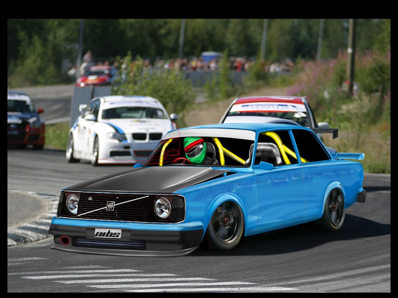
It's definately improving. The car looks oversaturated-you should be able to alter this quite easily later on.
Brushing is coming along quite nicely.
I feel the fb is too low to the ground but maybe you have plans for it already.
I'll be keeping an eye on this.
www.originalpimp.deviantart.com
I liked the first interior and drift rims better. Keep up the good work.
sigy.jpg
i think the new rims look good but they are really to far inside the well , could never work like this i'm affriad
i think you need to slightly enlarge the wells to really get the right wheel / car dimensions ..
the pervious wheels where placed better ... :-d
mijnlogo.jpg
really nice. i can't wait the final result. Success
autemosignaturecopy.jpg

Uploaded with ImageShack.us
Nice m8, but you should make car side darker IMO, because the top and the side seems to have the same contrast/brightnes :( Keep it up ;)
parasaspng.png
:::> eimiz design <:::
I think at the moment the car is lowered too much ;) The rims barely fit under it and the car appears to be scraping the ground. Raise it up a tad.
Well the Idea is to make it an old BTCC car wich is the main reason it's so low, the other reason is because its in a turn so it tilts a littlebit..
Old Hondas never die, they just get faster!
I still think its about an inch or two too low, the front lip appears to be touching the ground <_<. But it's your chop so do as you please
Redesigned some and st00ff! anyways i guess the pic speaks for itself :) now gimme some comments !:D

Wip? lol lost track. : VOlvo242Evowip23.jpg
Old Hondas never die, they just get faster!
what happened to the interiour ??
the driver / helmet looks like it crashes into the windscreen or is jammed between the glas and seat
the right seat and roll cage kinda look very very smudgy and the cage on it's own i cant make much of how it runs in the car (if it makes sense)

i know it sounds harsh but it's a wip an maybe you can use this c&c , it's ment well , so :-d
mijnlogo.jpg
Back to top

Please login to post