
Me too... It's better chop than few in Elite... 
Global Rank: 0th (7450pts)
Reg: Aug, 2009
Poland

Global Rank: 0th (4422pts)
Reg: Oct, 2009
Croatia

Global Rank: 0th (5493pts)
Reg: Nov, 2009
South Africa


Global Rank: 0th (11170pts)
Reg: Jan, 2010
New Zealand

Global Rank: 0th (16872pts)
Reg: Aug, 2009
Norway
very nice work mate, love the design, when you zoom it shows alot of brush strokes, wich i think make it not HOF worthy , but its not easy to do what you have done but you done it very well, colour,light,shadows, etc its all very well done 
But on zoom bits it looks very sloppy in places, i think you shouldt have posted them as it shows errors in some places hof is basically flawless artwork, like SNs Mini, that was flawless,
But it is also not right for me to say its not hof looking cus it is, but it just needs a bit more tlc ,if you cleaned up the smudges and the uneven ness, etc i think it would get hof status, as i feel someplaces you rushed it.
But the overall work is briliant ,lighting and shadows are very well done, and it sits right in the picture.
THere is jagged edges here and there wich needs looking at, and imo i think this artwork is ELITE worthy")
well done
glac
But on zoom bits it looks very sloppy in places, i think you shouldt have posted them as it shows errors in some places hof is basically flawless artwork, like SNs Mini, that was flawless,
But it is also not right for me to say its not hof looking cus it is, but it just needs a bit more tlc ,if you cleaned up the smudges and the uneven ness, etc i think it would get hof status, as i feel someplaces you rushed it.
But the overall work is briliant ,lighting and shadows are very well done, and it sits right in the picture.
THere is jagged edges here and there wich needs looking at, and imo i think this artwork is ELITE worthy
well done
glac

Global Rank: 0th (3781pts)
Reg: Oct, 2009
Brazil

Global Rank: 0th (2888pts)
Reg: Sep, 2009
Germany

Global Rank: 0th (11170pts)
Reg: Jan, 2010
New Zealand

Global Rank: 0th (7729pts)
Reg: Aug, 2009
Turkey
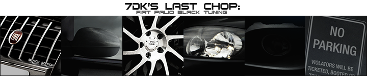
Man with an outstanding performance really is great in terms of visual and design would like to express. Reflections and light effects are very good. This much I like your work. Exterior design of the tool and its atmosphere is particularly great.


Global Rank: 0th (3798pts)
Reg: Aug, 2009
Estonia
Not exactly HOF, hold your horses 
But a great artistic performance! Some shape issues with the kit and symmetry issues with the front bar, but the overall überovercontrasted look works okay.
But a great artistic performance! Some shape issues with the kit and symmetry issues with the front bar, but the overall überovercontrasted look works okay.
