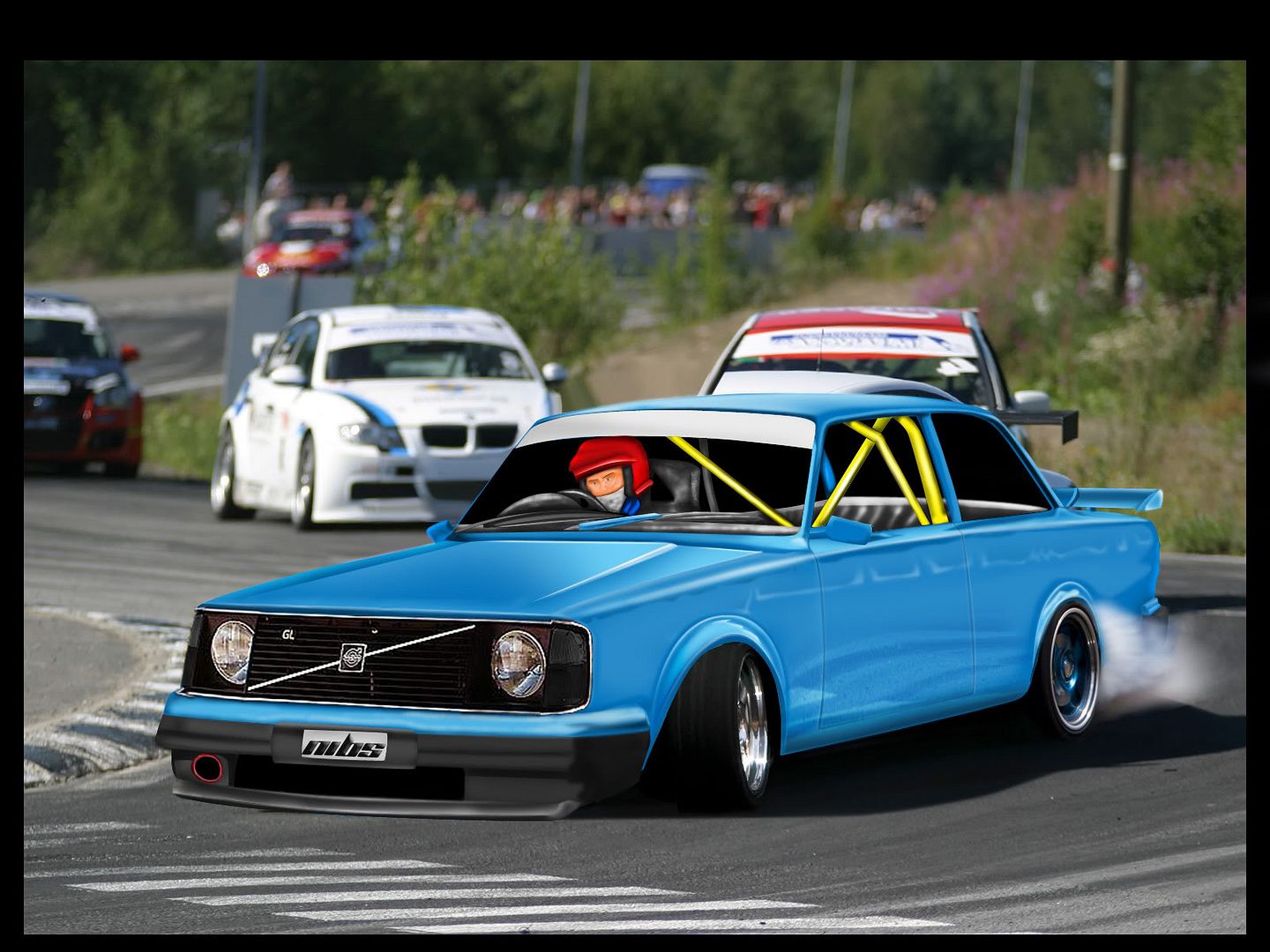
Added some more shit :P I just added the Drift Wheels for Fun :D wont keep em. i think...
anyways
VOlvo242Evowip6666.jpg
Old Hondas never die, they just get faster!
Like what im seeing. But you should do like Nordic man said, use a referance picture to help you know where to brush what part, and to help the tones get more natural. The overall look of the chop seems kinda artistic, so my suggestion would be to put it in a artistic enviroment, or make the car more realistic. Dont get me wrong mate - ive followed your chops, rigth from the start on PSU, you have defiantley improved alot! Congrats buddy!
signaturesw.jpg
The side is starting to turn out great :) And the chop is looking a lot better then I was expecting, referring to the car being a volvo 240 which I can't really stand :P Interior looks a bit tooney, nordics sugestion might be something to think about. Rims also, other then being the wrong style, look way small. Might wanna think about that when you find the actual rims. They need to be a bit bigger. Overall though I think this will turn out great! :) Keep going.

Cheers!
post-572-1270930804.png
post-572-1294695461.png
that fb is way too low for a race car, quite nice work so far
btw is the bonnet finished ? and keep it up
The front bumper is supposed to be bottoming out.. as it is a turn, i want to create a feeling of the speed.. But i do know its a bit low :p
Old Hondas never die, they just get faster!
looks aweosome .. mistakes have been said allready :P
sigsu.jpg

>> My DeviantART <<
these wheels actually look very good , need some blending on the front arch though
an the front lip really needs work it kinda looks really fake (cant explain nicer)
i hope you will get everything looking the same , car and bg since the car is very brushed and the bg realistic ..
try to add a filter and blend that , this could really work out !!
i know filter > artistic > cut out can work great if you work out the blending modes and how much to mower the opacity , some sharp edges could remain but they are easy to re work and then the bg would go more towards the car
if then the car get a tad more realistic the 2 should meet in the middle i guess
mijnlogo.jpg
Have now added new rims, i believe they fitted pretty well? anyways also redone design for interior hoping this will be a bit better.. :p
VOlvo242Evowop9.jpg
Old Hondas never die, they just get faster!
reflections needs more work to be more "sense"making
and the rollcage isn't same thickness all around
keep it up
Like the new rims, good find there. I think they might be sitting a bit low though.... The one in the back doesn't even seem to fit in the wheelarch. Hehe. So they still need some work there, But they are on the right track, cause the car looks more speedy allready :)

Interior will look nice when it's done I guess, but as pointed out you have to make sure the thickness is even all over.

JUst keep going.

Cheers!
post-572-1270930804.png
post-572-1294695461.png
Back to top

Please login to post