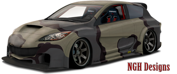
I think all of the work you did to the car looks pretty amazing. There's just 1 thing that kind of kills it for me. The perspective of the background doesn't match the car. The car is very much pointed down towards the front left corner while the bg slopes more uphill on the left side. The chop looks really great, but with a bg that matched the perspective it could look 10x better.  Keep it up though, I look forward to seeing what you come up with next.


