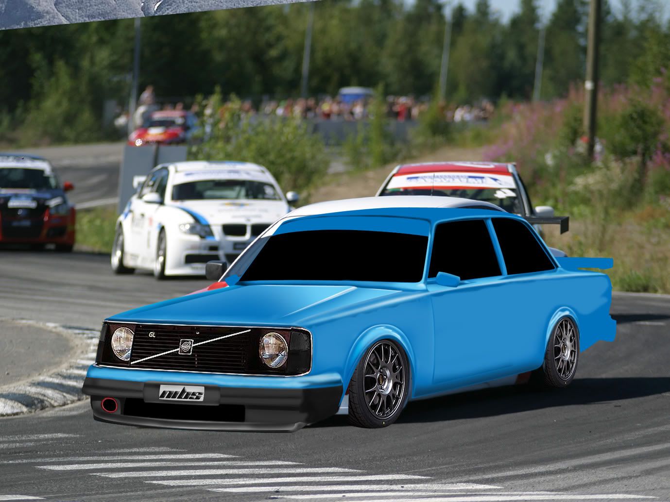
tbh, the blue bits are much better than the grey areas
Global Rank: 0th (12347pts)
Reg: Aug, 2009
Finland
Global Rank: 0th (4637pts)
Reg: Sep, 2009
Sweden
Global Rank: 0th (859pts)
Reg: Sep, 2009
United Kingdom
Global Rank: 0th (4429pts)
Reg: Sep, 2009
Sweden
I'm no fan of those old volvos, but this has potential. You should try and find some spinning rims for it as well, cause I am guessing you are gonna put some blur on those you have now? And rims that are spinning allready look so much better. Really nice work on that front wing though 
Just saw that the hood is a bit off, the line on the cars right side should be more to the center to get that raised effect. Measure from the line on the cars left side to the wing, and then the same on the other side you will see that the lengths are different.
Also I think the lighting might be off in the bg? Seems on the highlights that the light is shining from the viewers direction, but if you look at the cars in the bg and the shadow the light is comming from the cars right. So you are brushing light from the left, but actually it's from the right.
But keep it up, maybe a bg change later or something could fix that.
Cheers!
Global Rank: 0th (4637pts)
Reg: Sep, 2009
Sweden
Global Rank: 0th (704pts)
Reg: Oct, 2009
Sweden
Global Rank: 0th (17617pts)
Reg: Aug, 2009
Australia
Global Rank: 0th (4637pts)
Reg: Sep, 2009
Sweden
Global Rank: 0th (4684pts)
Reg: Aug, 2009
Norway
Its looking great man! Loving the overall look of the car!
But to me the front bumper seems abit off.
But to me the front bumper seems abit off.

Website: www.takinkroop.com DevArt: www.takin.deviantart.com
Global Rank: 0th (12347pts)
Reg: Aug, 2009
Finland
iCandi wrote:
Its looking great man! Loving the overall look of the car!
But to me the front bumper seems abit off.
But to me the front bumper seems abit off.
how come?
remember that there is the bend in the bumper
tbh the frontbumper looks like from totally another chop, since the brush quality is way worse, and the lines in generally are wobbly as anything
the blue areas are nice, but the rims need to be moving, and the angle of the rear needs some heavy altering


