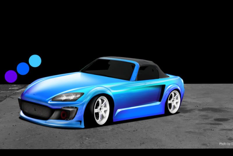
i did this to show you the angle issues
best way to show what is going wrong is by fixing it
i hope your cool with that
i just did this superquick so ....
i rotated the car and part of the tarmac so it sits level with the bg ..
i heard you talking about trying to match the bg better to the car ..
in this case that would never really work out good , the bg is horizontal so the car needs to
come towards the bg
also i really downtoned the blues to match the mild bg better , and turned the sky into more a blue-ish sky
this was 4 minutes work and just look at the result , comes together way better right ??
now you can see the rear wheel is still of angle , i usually first give the car it's correct ride hight and then look at the angle of the car and new bg and then place new wheels
anyway it's all about angle / perspective and balance between car and bg (color wise and quality wise)
imo this bg looks cool now
hope you can use this , your skills are there it's just to need to invest time on angles and perspective's ..
before

after

btw you could use this surface so well for refs on the lower part of the skirt and fb corner

just make selections and use the clone tool and set the blending mode to whatever looks good good low opacity so it shows it's there but it's not standing out
bg wise you could do this > select the far side bg only , filter cut-out , set to soft light , lower the opacity so it looks almost realistic but still more towards toon/brush
then i overbrushed dark blue to the whole pic and set the blending mode different (play with the effect) and it's more whole (car and bg)
these things are only the tip of the iceberg what you can do to really make a car more realistic or blended together with the bg properly ..
i always spend tons of work on this , people dont see what you have done but it does make your chop btter in the end i believe , it just adds 40% extra
i mean a lot of perfectly brushed chops i've seen here could be made twice as cool with maybe 20 minutes of work

again i did not toutch your car one bit , only rotated it the right way , gave the bg a slight more toony look , gave the whole pic a blue colorfilter and this was not done properly but just superquick to show you the possibility's ..
i mean i know you want to get back up the ladder and thats why i did all this to show you it's not the actuall chop you need to worry about it's angle / perspective an maybe things like this (coloring) could help your chops also
Post edited November 05, 2009 at 06:26:04 PM by rich


