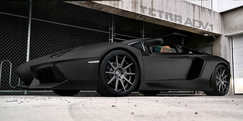
hey all, thanks for your comments here, i really appreciate for all your kindness, :-d
maybe i'll start it from beginning , find the background (with car of course) that the position match with the car that i brush , then use the reflection of the car that exist in my background,

am i right ? <_<


Thank's :D
I have a revise =O
revise2.jpg


BIG RESOLUTION :mrteeth:
revise2.th.jpg Uploaded with ImageShack.us


*PS: Forget about the ford logo because this is was just WIP :D
i like the revise. just build on the refs making the white spots 'pop' look at lots of cars in the same enviroment look for similar traits try incorperate while always refering to the reference picture, hope this helps. :-d
Sainity is the playground for the unimaginative


8233221867_cc85bc4fbc.jpg
i agree, eventhough not close to perfect it is really big hop on to the right direction
Tetra wrote:
i like the revise. just build on the refs making the white spots 'pop' look at lots of cars in the same enviroment look for similar traits try incorperate while always refering to the reference picture, hope this helps. :-d
nordic man wrote:
i agree, eventhough not close to perfect it is really big hop on to the right direction

thank you all, your support make me wants to spend my spare time to continued this chop
and i have new updates

revise3.jpg
Post edited December 14, 2010 at 11:00:00 PM by MC_I
uhhm, looking good, keep it up
A lot better than the green one, looks shinny!
:awesome:
dA
Looks a lot better than the green! very nice color, keep it up :)
whow thats 4 times better then the irst one

keep this up =O
mijnlogo.jpg
tuneR97 wrote:
A lot better than the green one, looks shinny!
thanks

i have new little update148251_1619872971801_1085708339_31636705_2022033_n.jpg
Back to top

Please login to post