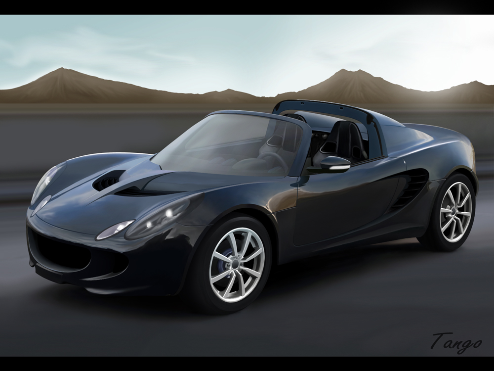
Oh my god....THAT is VERY COOL!! 
Global Rank: 0th (6735pts)
Reg: Aug, 2009
Russia
Global Rank: 0th (10541pts)
Reg: Aug, 2009
United Kingdom
thanks ! and thanks jack... i will modd it after i finished with other stuff and when i find donors / inspiration ! thanks for the comment mate //
Global Rank: 0th (6631pts)
Reg: Feb, 2010
Sweden
Global Rank: 0th (10541pts)
Reg: Aug, 2009
United Kingdom
thanks mate . i agre . ive been doing that in school with a shit tablet with no pressure sensitivity etc .. ill do the texture etc at home with my tablet  OOOH YES < my new word
Global Rank: 0th (12291pts)
Reg: Aug, 2009
Finland
Global Rank: 0th (16036pts)
Reg: Aug, 2009
Norway
HI Mate you wanted me to looks so here is my judgement
OK 1st of the car is floating, so make sure you paint more shadow under the left front side of the car.
2nd The headlights have blurry lights in them try a do a star burst instead, for sharpenss like the rest of the car,
3rd The Front vent area needs work, add mesh , and also more details to the bottom lips the closest one looks flat and dont feel any debt in at all, the 2nd one on the far side looks just wrong all together.
The middle one also needs something it just looks like a white line
4th The part in the middle with the hood, it needs more detail or even reflections, it should reflect the vents and the hood onto itself.
5th The Seats looks wonky , the closest one looks off at the top , they both should follow the flow line of the roof line.
6th the background is nice but lacks details, to fix that blurr it to make it just be something there but not to be focused on.
7th Tires need work, add some treading .
8th Steering wheel looks wonky as well, could look more rounder
9th Since there is sharp bright light coming from the back the car interior ( dash ) should be lighter, and the part behind the seats in the middle should be lighter to
That bit you have drawn behind the right seat looks odd it should be dark and not light as the sun comes from the back of it.
Thats just the bad bits
Now the good bits
Side reflections are wicked well done, mirror and wheels are good to and side vent looks exellent
I hope this helped you and brought u just one step closer to HOF
cheers
glac
Post edited November 19, 2010 at 10:14:23 PM by Glacius
Global Rank: 0th (5177pts)
Reg: Aug, 2009
United Kingdom
kit ?
im pretty sure jack will love this car already
the hennessey venom gt
http://www.blogcdn.com/www.autoblog.com/media/2010/11/01hennessey-venom-gt-cnc.jpg
maybe take some inspiration off it
im pretty sure jack will love this car already
the hennessey venom gt
http://www.blogcdn.com/www.autoblog.com/media/2010/11/01hennessey-venom-gt-cnc.jpg
maybe take some inspiration off it
Global Rank: 0th (10541pts)
Reg: Aug, 2009
United Kingdom
Thanks a lot Glac ! and you to Zero .. i will fix everyone of them glac and i will try and make a simelar kit 
Global Rank: 0th (1347pts)
Reg: Dec, 2009
France


