new update?
Global Rank: 0th (12484pts)
Reg: Aug, 2009
Finland
Global Rank: 0th (4108pts)
Reg: Dec, 2009
Estonia
Global Rank: 0th (4108pts)
Reg: Dec, 2009
Estonia
Global Rank: 0th (24692pts)
Reg: Oct, 2009
Portugal
Global Rank: 0th (4108pts)
Reg: Dec, 2009
Estonia
Global Rank: 0th (1601pts)
Reg: Oct, 2009
United Kingdom
Global Rank: 0th (4108pts)
Reg: Dec, 2009
Estonia
Global Rank: 0th (10893pts)
Reg: Aug, 2009
United Kingdom
Global Rank: 0th (4108pts)
Reg: Dec, 2009
Estonia
hello 
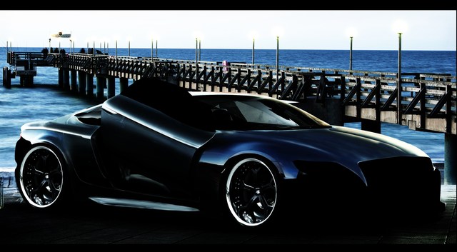
i have found the final background to this one.
i have done very much work with this concept.and have much more to do.
im puting here little teaser to show whats waiting to finish.
i put it lot of contrast on it right now because the final work will be suprise
but ok no long story.
here it is and please dont tell me it´s a piece of crap

ryaz
i have found the final background to this one.
i have done very much work with this concept.and have much more to do.
im puting here little teaser to show whats waiting to finish.
i put it lot of contrast on it right now because the final work will be suprise
but ok no long story.
here it is and please dont tell me it´s a piece of crap

ryaz
Global Rank: 0th (4770pts)
Reg: Sep, 2009
Sweden
Looks like it has potential, will be interesting to see the finished result. However, don't forget to change such that you don't see the old bg through the window in the car. Also blur all the edges of the car such that they fit better in the new bg, now the car is too sharp against the environment. Looks C&Ped into the bg. Easiest way to fix it is by taking the waterdrop tool and smudge the edges a bit. Also the bg's perspective seems just a tad off. Transform it and squeeze the top together, as in move the top of the bg down, that should sort the perspective differences a bit. Can't tell you how much you should change it, you'll have to test. 
But it looks like an interesting concept,
Cheers!
But it looks like an interesting concept,
Cheers!


