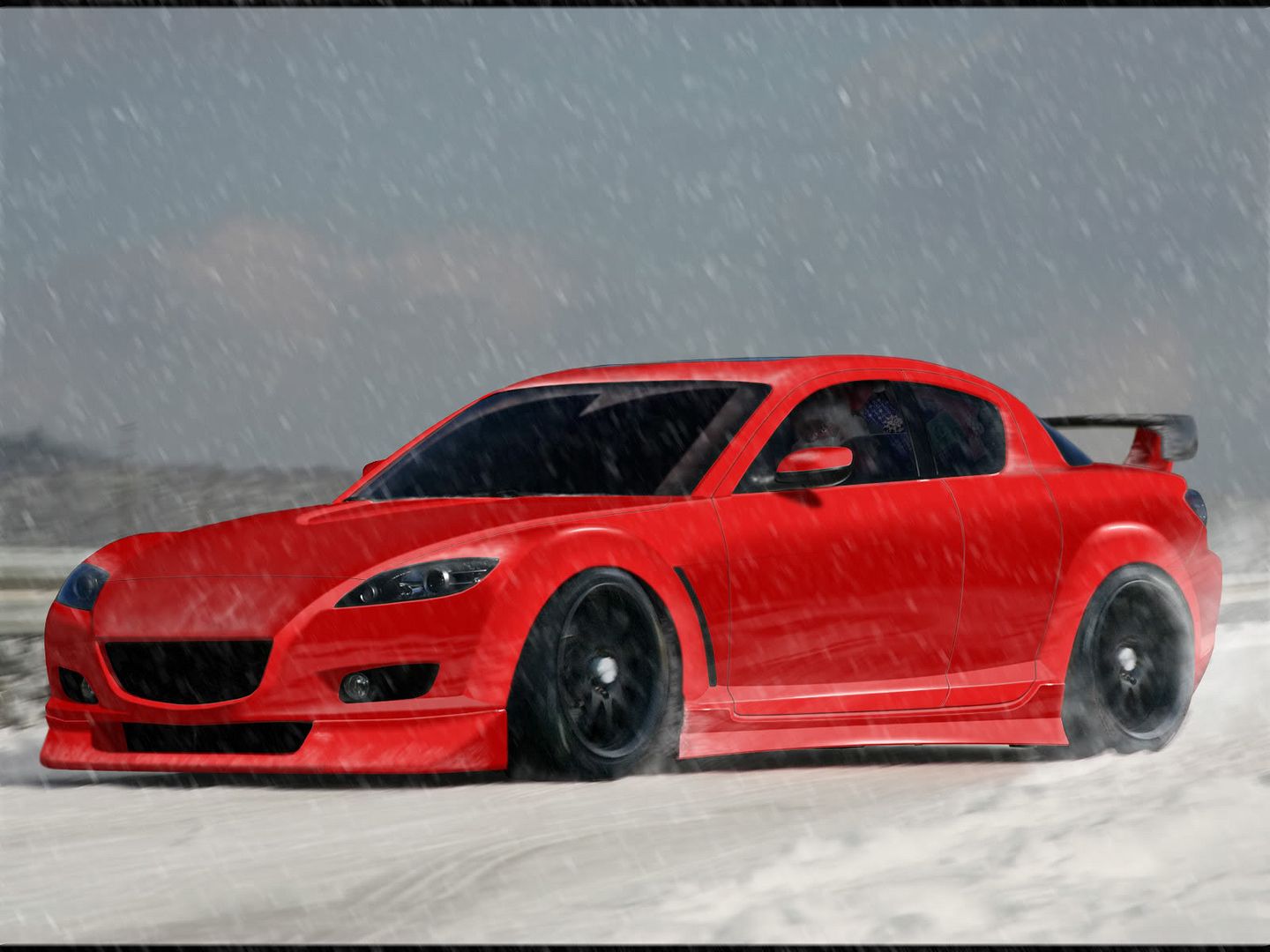
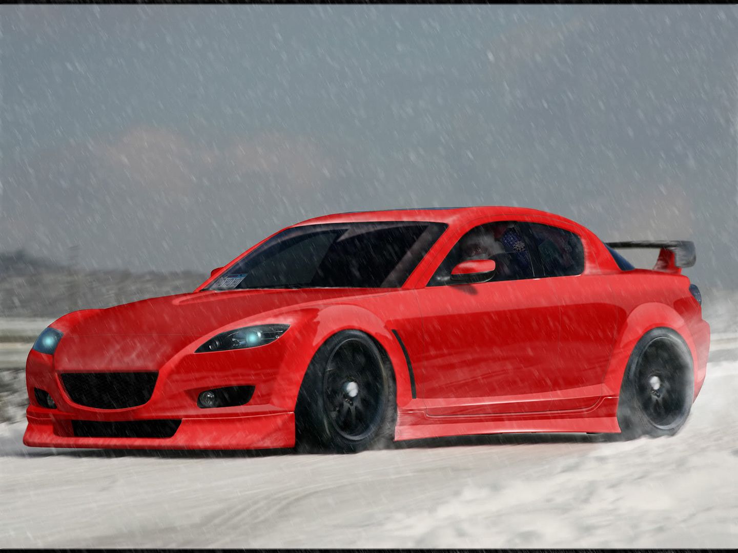
Looks quite good. Although a little toony but no real problem,could be fixed easy. I do think that the front wheel should turn left (so it turns against us) as the road seems to turn this direction.

Also i do think the highlights might be too bright if you look at the Background/sky, at the moment it seems like the sun is Pointing towards the car.
Waiting for another update ;)
Old Hondas never die, they just get faster!
Appreciate the feedback :-d I am not sure which highlights you are referring to. I agree with the mention of the front wheel, and think i have that about fixed. Here's a small edit with the wheel turned and I've adjusted the highlights slightly :)

01rx8contestentryinmotionwip9.jpg
hi res:http://i24.photobucket.com/albums/c2/lukej6009/01rx8contestentryinmotionwip9.jpg
autemosig.png
Ok, here's a decent update, unlike yesterdays slew of nonsense. I'll admit I was super bored and hoping for a few pointers on making it look more realistic. I think I'm getting there slowly. :) Maybe not, you be the judge.

01rx8contestentryinmotionwip11.jpg
hi res: http://i24.photobucket.com/albums/c2/lukej6009/01rx8contestentryinmotionwip11.jpg
autemosig.png
looking better and better tbh :P
though lakcs alot in few areas, but overall getting there :-d
something starts to grow out of it :-d
Welcome to Wigs-Lace. Offering wigs, hair extensions, falls :awesome:

hotnigbum.jpg

ToMiii @Facebook
Back to top

Please login to post