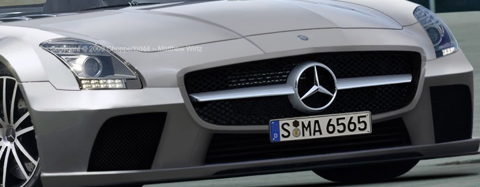
There is a blurry area on the fb just below the cars right headlight! You should definently fix that before posting the real thing!

The numberplate helps making the front thinner, but it's a rather odd placement of it I would say. Hehe. Right infront of the MERC badge? Also I think you need to add some shadows and such to the lower part of the fb... looks a bit unfinnished/toony at the moment. But I agree, it's getting close to completion :)

Cheers!
post-572-1270930804.png
post-572-1294695461.png
Algeroth wrote:
There is a blurry area on the fb just below the cars right headlight! You should definently fix that before posting the real thing!

The numberplate helps making the front thinner, but it's a rather odd placement of it I would say. Hehe. Right infront of the MERC badge? Also I think you need to add some shadows and such to the lower part of the fb... looks a bit unfinnished/toony at the moment. But I agree, it's getting close to completion :)

Cheers!

thanks dude!
92% of the teenage population has moved on to rap. if you are part of the 8% that stayed with rock, put this in your profile
i love it, th bodywork and the sheer width of th thing, you know theres a huge v10 lurking sumwhere in it lol, you gonna put anything in the two outer scoops like mesh or something?
forumsigu.jpg
not bad at all mate. the brushing youve done so far looks pretty awesome. The only issue i have atm is style. the S2K roof just doesnt go with that elongated front end. either reel that in to something sleeker and sexier, or change the roof for something along the lines of a big koenigsegg style. The execution is near perfect so far, and i usually wouldnt criticise style because that's subjective... this crossed the line though xD
Hello.
Lol hey style is everyone's opinion. The purpose is the kit mostly.

btw jack i'll try my hand at the roof but it is the stock roof off the SLS :P

So although style may not be everyone's taste i hope i can pull of that realism you mentioned cuz thats my goal on this bad boy. Theres an update but i'll do more before posting again. Fixed things like body lines up front and the plate
92% of the teenage population has moved on to rap. if you are part of the 8% that stayed with rock, put this in your profile
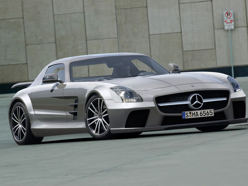
New update! Redid the door handle to work with the gullwing lol oops. Also, new body lines added near the grille as pointed out by someone. Plate moved away from over the badge, hood badge added, and a mesh attempt

Help with the mesh? Really my last step i can honestly want to do with this chop


teaser6.jpg
Post edited November 05, 2009 at 02:57:26 PM by Chopperkid44
92% of the teenage population has moved on to rap. if you are part of the 8% that stayed with rock, put this in your profile
There is still some smudge underneath the right headlight mate :/ It's to thinn to be a highlight, so it mustbe some smudge. Good choice there moving the numberplate, looks a lot better now. However, there is still a need for some shadow work on the lower part of the fb. Har to explain where I mean but I will try.

If you look at the hole to the furthest right on the FB on the cars right side. Then go to the holes top right corner looking at the car. Then there should be a shadow running from there across that "beam" thingy to the opening of the big center hole, and then down to the bottom left of the hole. Should have around 1 pixels of feather, and be a bit darker at the top. And something similar on the other side, but obviously on the inside there of the bottom center hole.

Other then that this is looking really awesome! I really like what the styling has done to the car, cause I am no fan of the SLS, but I like the s63 Black (I think that's it's name) and the cross betweem them works really well! Wouldn't be all to suprised if something very similar to this will be built in a not to distant future. :)

Cheers!
post-572-1270930804.png
post-572-1294695461.png
Algeroth wrote:
There is still some smudge underneath the right headlight mate :/ It's to thinn to be a highlight, so it mustbe some smudge. Good choice there moving the numberplate, looks a lot better now. However, there is still a need for some shadow work on the lower part of the fb. Har to explain where I mean but I will try.

If you look at the hole to the furthest right on the FB on the cars right side. Then go to the holes top right corner looking at the car. Then there should be a shadow running from there across that "beam" thingy to the opening of the big center hole, and then down to the bottom left of the hole. Should have around 1 pixels of feather, and be a bit darker at the top. And something similar on the other side, but obviously on the inside there of the bottom center hole.

Other then that this is looking really awesome! I really like what the styling has done to the car, cause I am no fan of the SLS, but I like the s63 Black (I think that's it's name) and the cross betweem them works really well! Wouldn't be all to suprised if something very similar to this will be built in a not to distant future. :)

Cheers!

thanks dude! About the front shadow you speak of, do you mean the slight shadow caused by the snout grille of the car? o.O

I hope thats what you mean. I'm still a little lost on the whole smudge thing. does it just need more defining of the lines around the right headlight?

Haha theres actually been a posting on worldcarfans.com about a black series of this but no pictures. I wanna try to get this image to them so i can get them an artist speculation render and some good credit for me B)
92% of the teenage population has moved on to rap. if you are part of the 8% that stayed with rock, put this in your profile
is this better on both ends?

teaser7post.jpg
92% of the teenage population has moved on to rap. if you are part of the 8% that stayed with rock, put this in your profile
lookin good, far side mesh looks a tiny bit too dark for the depth of the scoop if you know what i mean.
forumsigu.jpg
Back to top

Please login to post