Global Rank: 0th (10618pts)
Reg: Aug, 2009
United Kingdom
Global Rank: 0th (3010pts)
Reg: Nov, 2009
United States of America
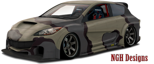
Looks great so far. Some of it looks pretty toony right now though, mostly the wheels. But maybe once you get some refs and possibly some more shadows on the wheels that will probably get straightened out.  Were you trying to make it pink? Just curious cause its right on the verge of some parts looking more redish and other pink.
Keep at it, nice to see you back. No more filthy links ok?!
Keep at it, nice to see you back. No more filthy links ok?!

Global Rank: 0th (2439pts)
Reg: Aug, 2009
United Kingdom
Global Rank: 0th (10618pts)
Reg: Aug, 2009
United Kingdom
thanks people !! and luke .. i didnt try to make it pink lol ... this was the inspiration for colours i used


Global Rank: 0th (3010pts)
Reg: Nov, 2009
United States of America
Global Rank: 0th (17602pts)
Reg: Aug, 2009
United Kingdom
Global Rank: 0th (10618pts)
Reg: Aug, 2009
United Kingdom
hahah thanks mate .. will do  gonna try and make it perfect
Global Rank: 0th (3269pts)
Reg: Jan, 2010
Brazil
looks great, can't wait more updates 
Global Rank: 0th (955pts)
Reg: Aug, 2009
United Kingdom
jackdarton wrote:
looking epic carl. I wont comment on how much you're improving because i say it every time but this is really starting to look stunning. remember to add lots of little detail to the reflections etc. Keep it up
Everytime I see a wip/chop, their my thoughts. Looking great so far.

Global Rank: 0th (5857pts)
Reg: Aug, 2009
Macedonia
looks great so far, but i think there's lot more work to be done here 
firstly the seats look wrong to me, both of them, they're off and they're small/to high up.
secondly if you take a closer look at the reference for the colour, you can see that the front bumper area of the car has some, even none of those purple/pink hues you have on your front,
and this is why the front side of the front arch looks really odd.
also maybe you could add some black spliter, or somethin on the lower area of the fb to go with the side skirt
that's the only thing i see really wrong so far
p.s. is that the highest rez you have of the reference? cos that scuby looks sweet
Post edited January 20, 2010 at 02:04:42 AM by Anton


