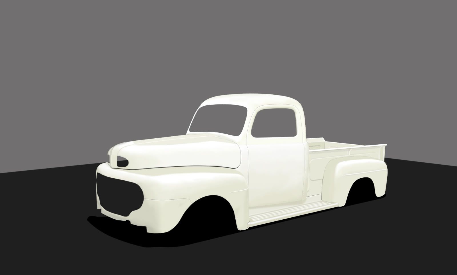
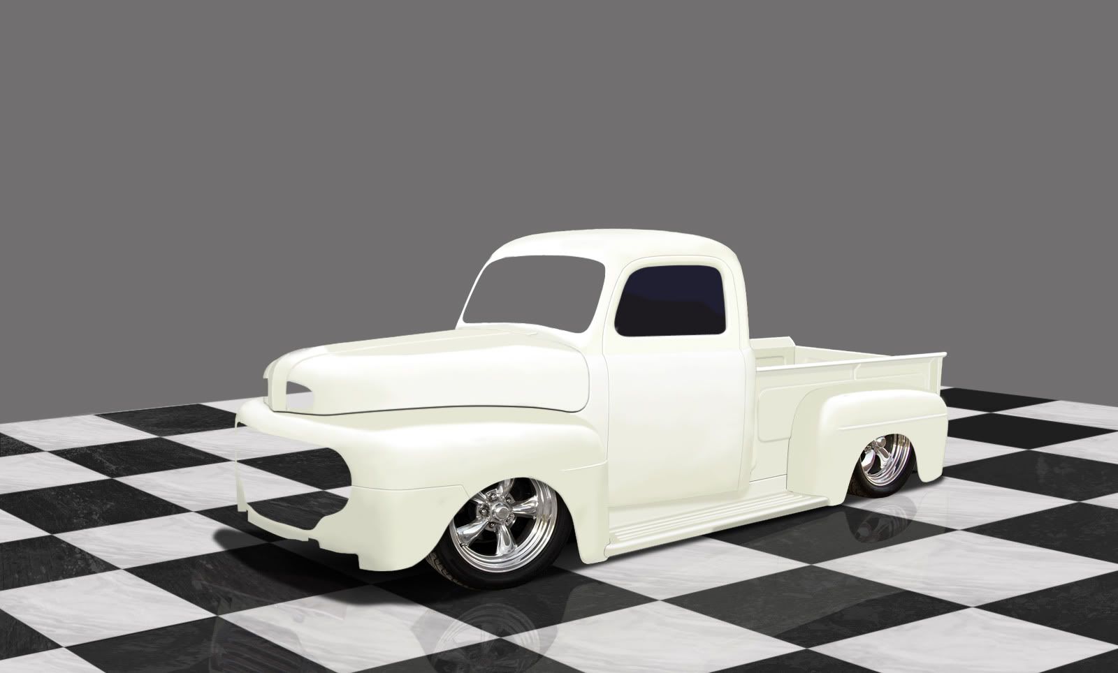
1949 Ford WIP

Started this tonight, going to be a full brush before I'm done. Unless I get lazy then I will leave the wheels as C+P. Doing this as inspiration for my Dad to finish the real thing that's sitting at home in the barn. Anyway here it is, body is all brushed.


Orig:
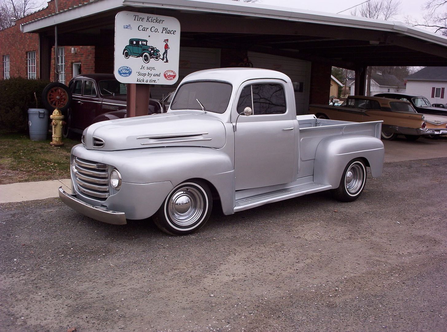
1948ford1.jpg

WIP:
z1949fordwip1.jpg
hi res: http://i24.photobucket.com/albums/c2/lukej6009/1949%20ford%20chop/z1949fordwip1.jpg
autemosig.png
looking very very good so far =O
stunning execution
i like the white its a sort of cream white ..
i would suggest you keep it this low wheels tucked in the wells
some great details , cool bg , add some refs

could be the only witch is promotion material

just have to take your time :-d
mijnlogo.jpg
Thanks Rich, I'm hoping the outcome is pleasing :) Plan for now is to sit that low, not sure about the BG, was thinking about making my own shop setting, for now I have this temporary marble looking floor I made. We'll see what tomorrow brings. :P

z1949fordwip2.jpg
autemosig.png
awesome work so far mate ! maybe its my screen but i think its too white XD .. i cant see it properly lol.. and the marble floor is awesome ! not sure aboiut the rims so far though
sigsu.jpg

>> My DeviantART <<
Great attention to detail atm but i would definetely get some different rims. keep up the quality
picture4hx.png
very nice so far, but the car should be lower in the front, and maybe a little taller at the back, would probably look more agressive. :) keep going dude!
car town @ facebook
looks awesome so far!
aetoq8.jpg
My dA
Yeah really awesome so far :D Great details, but as Tango said it might a be a bit too white although it could be my screen. Keep updating !
Old Hondas never die, they just get faster!
Thanks guys, as far as the brightness of the color, I struggle with that on my monitor too...if I sit up in my chair it gets brighter and slouch it gets darker lol damn lcd. On note of the wheels, you guys just don't like the style? Or do you think the fit/perspective is off?
autemosig.png
keep the floor !!!!!!
wheels could be better make sure they are the same size the front one is to big now
mijnlogo.jpg
Back to top

Please login to post